Xiaomi
Xiaomi HyperOS screenshot leak reveals new Control Panel, Themes, Lock Screen and More

Earlier this week, Xiaomi announced HyperOS, its new operating system designed for all of its ecosystem, and a few days ago, a major leak revealed key aspects of its UI and other features. Let’s take a look at the details from the images.
Control Panel:
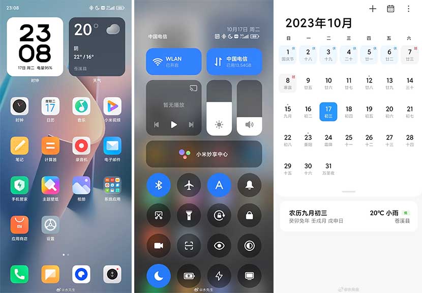
The new HyperOS control panel is not much different from MIUI 14 in terms of appearance. However, there are two major changes made in the layout and additions. First is the inclusion of a media controller widget and second is a smart device management. However, more of the existing arrangements will be familiar to the MIUI users.
Notifications Panel:
Another thing to note is that HyperOS will provide smarter notifications management than MIUI 14, such as a priority-based notifications system.
Home Screen
The home screen layout is basically the same as MIUI except for the refinements in-app icons, which are now slightly curved than the past version.

Typography:
From what we can see in the screenshots, some apps have tweaked typography/fonts and this may be used for better visibility for the users.
Themes:
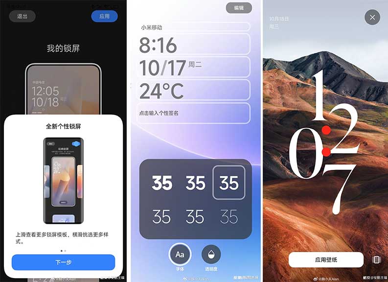
However, this new HyperOS is probably most focused on customizations for themes and lock screens. The company has added three new theme styles that you can choose from:
- Magazine
- Classic
- Rhombus
Each of these has various styles of lock screen style and font arrangements on the screen. These also support different types of lock screens and wallpaper effects including wallpaper depth.
Another thing to note is that Xiaomi has focused on using new font and widget customizations for the lock screen. All of these are likely to gain attention from the users based on their offerings.

Launch:
These are just a few observations of what we can see from this screenshots leak of HyperOS but there’s more that Xiaomi may have to share when the software makes its official debut.
(source)


