EMUI
What’s your most liked and disliked features or changes of EMUI 10.0

Back in August, Huawei launched the new EMUI 10 based on Android 10. Compared to EMUI 9.1, this new version comes with a number of new features, optimizations, and improvements that weren’t avaialble in the previous version.
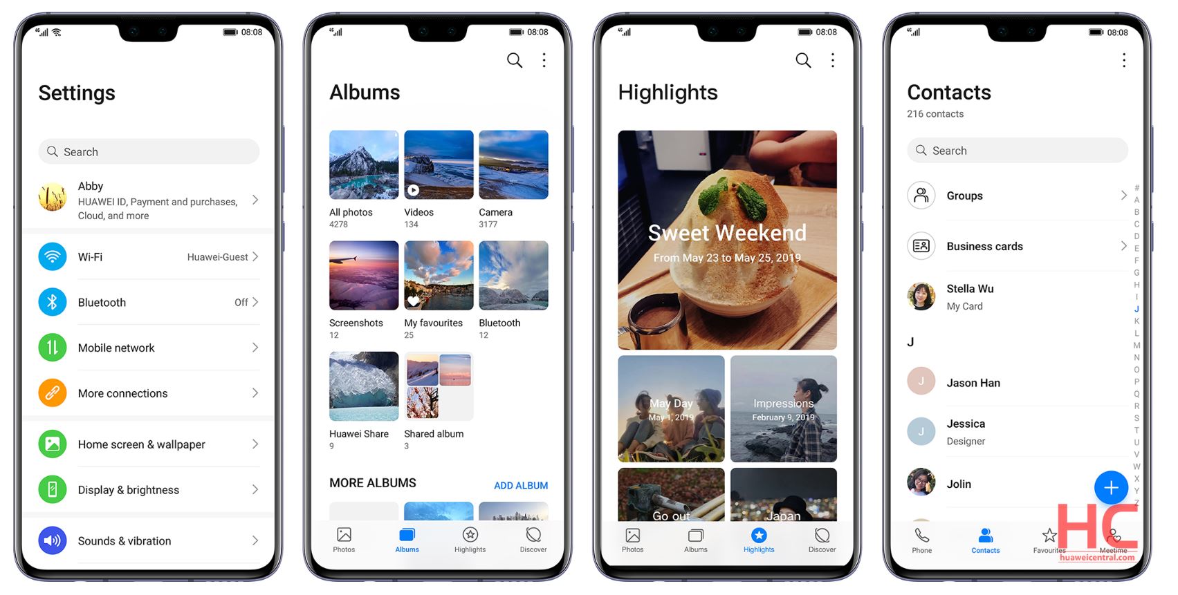
EMUI 10.0 features and improvements include the Magazine style user interface design, which organizes the screen content similar to a magazine and makes the menu, message, and dialer much organized.
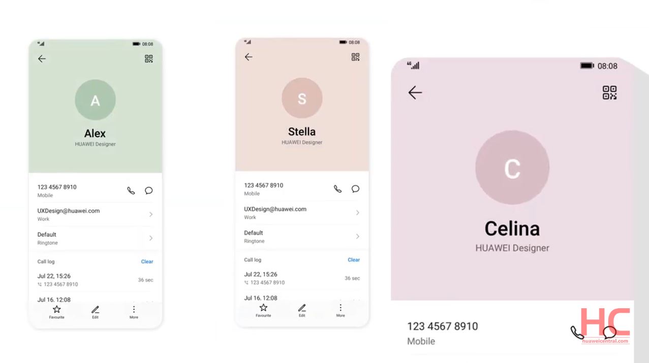
Morandi Color has a new two-level color scheme on the top part and the bottom part of the display. Golden Ratio Icons, to make the interface more visually friendly, the icons design has received a golden ratio.
New Animation effects, the user experience now comes with more smooth and dynamic animation effects that can be experienced through hands and eye combination. The feature for UX improvement expands to elastic touch, swiping trajectory movement, and comfortable transition between apps.
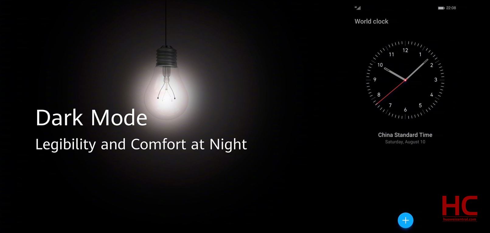
Dark Mode: In our opinion, Dark Mode is one of the best and most awaited feature that Huawei brought with EMUI 10. This new feature directly adapted from Android 10 and makes users easier to interact and reduces eye fatigue in low light conditions.
These are some of the biggest improvements that Huawei brought into its EMUI 10.0 mobile operating system. These are some of the key changes that we’ve mentioned in this article.
We would like to know what’s your take on these features and the improvements. What you liked and what you’ve disliked in the EMUI 10.0? Let us know in the comments.


