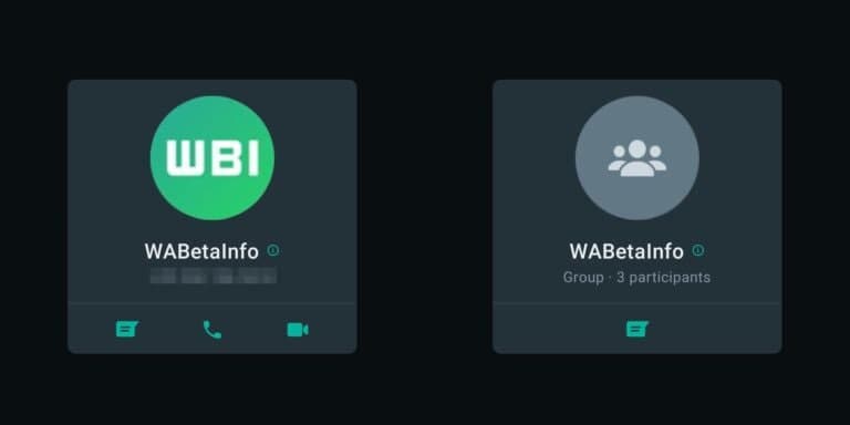
New Redesigned WhatsApp Contact Card brings a more modern look

After the rollout of WhatsApp 2.21.18.9. Android beta update it’s informed that WhatsApp is working on the redesigned contact card. The new layout of the contact name card has a more high-style look, presenting all info in an easy spotting manner.
The contact name card shows information about individuals or groups and offers certain ways to communicate with them. For example, you can send an instant message, start a voice or video call, or access related information of that particular contact. Furthermore, users won’t need to open the chat section for making calls and seeing the info.
To access any contact card, click on any profile in the WhatsApp Chat list and the card will appear on the window. You can choose any way to contact the individual. However, the contact options are different for groups and individuals. First, let check the preview of the new layout-

(WhatsApp redesigned contact card, image from WABetaInfo)
As you can see, the new contact card frames the circular profile picture instead of a square picture frame. The contact name has been placed below the profile image and has the info button next to the name. Pressing this info button will lead the user to the contact setting of that specific contact.
Meanwhile, the contact options including sending messages, making voice calls, and start video calls are similar as previously. It allows direct contacts for the user if he/she doesn’t want to open the conversation.
Also Check: New WhatsApp Disappearing Mode gives you more control over the privacy
Availability:
This new contact card layout is in the developing stage and hasn’t been rollout for the public yet. The team is making more changes and will release it with further updates. Until then stay connected with us.
More WhatsApp Info:
Last week, WhatsApp released the revamp business info after the iOS devices. The new design features sidewise arranged contact modules, news and media bar design, and other changes.
(Source- WABetaInfo)


