Comparison
iOS 14 vs HarmonyOS 2: Dark Mode feature comparison

Huawei founder and CEO, Ren Zhengfei mentioned multiple times that its company is inspired by U.S. smartphone giant – Apple. Everyone knows iPhones and their vast ecosystem and dominance in the market cannot be overlooked.
Yet Huawei had its own challenges in the software section to sort out after the U.S. Ban and the Chinese tech giant has come up with a solution in the name of – HarmonyOS 2.
This new operating system comes with lots of new features that directly challenge Android and iOS. In this case, Its important that we explore what HarmonyOS can offer better than the existing two OS.
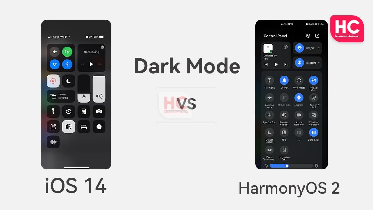
Therefore, let’s initiate our HarmonyOS 2 comparison against iOS 14, as for this head-to-head battle, we’ll be comparing the Dark Mode feature on both of the software systems.
We’ll be conducting this iOS 14 vs HarmonyOS 2 Dark Mode comparison of the following UI elements while keeping the dark mode feature on.
- Quick Settings
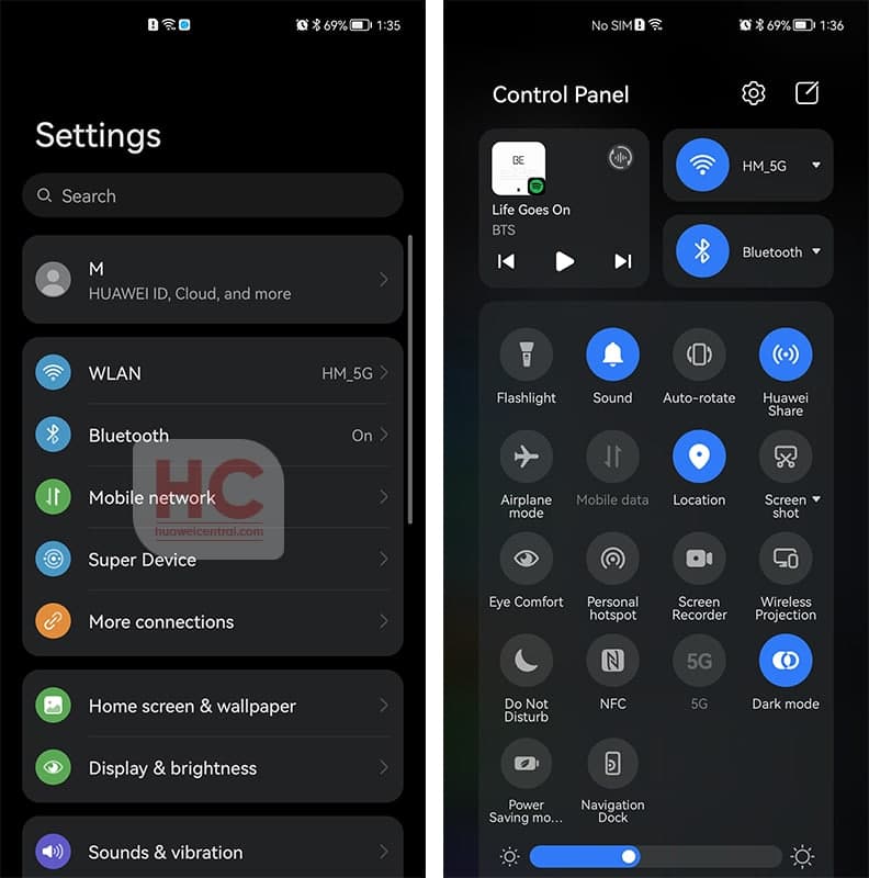
- Settings Menu – Menu icons and view
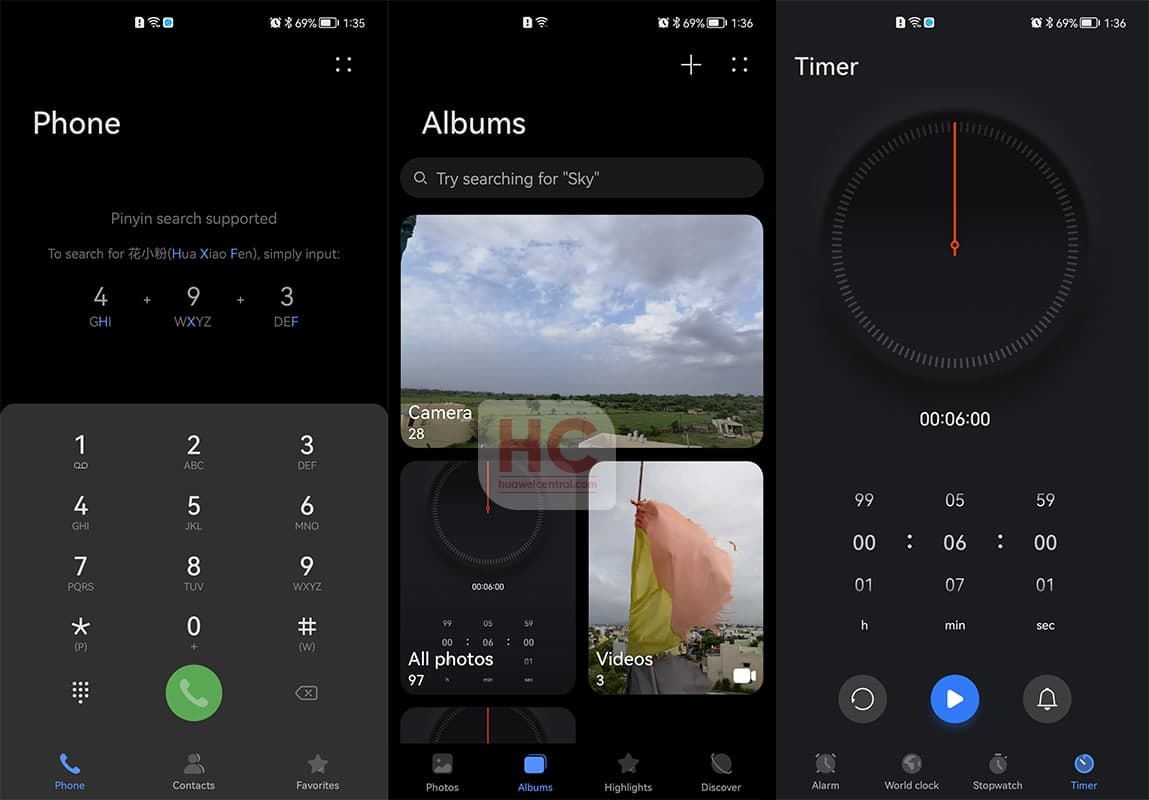
- Apps – Clock, Gallery, and Dial
iOS 14 Dark Mode:
The dark mode appearance on iOS 14’s quick settings panel is subtle and provides a good viewing experience for the users. The quick settings shortcuts are easy to select and tap.
The settings menu is quite good but the text and background color have high contrast, which increases even further with the level of brightness. Similar happens to Applications including – clock, gallery, and dialer.
HarmonyOS 2 Dark Mode:
Huawei has greatly improved the efficiency of the dark mode throughout the entire HarmonyOS 2 operating system. As you can see the new Control Panel is showing better shortcut switches that are clearly visible and provide a good sense of vision after enabling the dark mode.
Coming to the Settings menu, the redefined color system of HarmonyOS 2 lets you view the exact information such as icons and labels without hurting your eye. The colors are not too bright nor too dull, as it implements a mixture that suits the user’s eyes for prolonged hours.
Furthermore, the dark mode aesthetics in HarmonyOS 2 also reflects on the system apps including phone dial, gallery, and clock app.
Conclusion:
We cannot deny that iOS has one of the best Dark Mode UI themes but the time has brought us to the HarmonyOS 2, which currently surpasses the iOS 14.


