HarmonyOS
Huawei adds dynamic animations in HarmonyOS, iOS to get real competition

For the first time, iOS is about to get real competition in animations because Huawei has added new dynamic and interactive UI/UX movements for HarmonyOS 4.0.
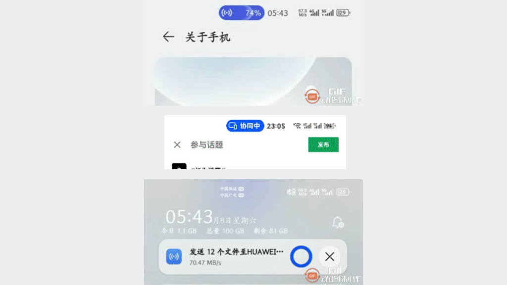
A recent build of the HarmonyOS 4.0 developer beta revealed new changes. Things are now different in the status bar and it is completely new to the HarmonyOS ecosystem.
The animation shots leak of the status bar shows fluid element movement in the status bar content. As it is shown, the notification expands out of the status bar and reveals the content. Meanwhile, the clock changes position to the right and adjusts accordingly.
HarmonyOS 4.0 animation pic.twitter.com/ahUbbzOBcV
— Deng Li (@MrDengLi) July 20, 2023
In the second clip, you will see a file Huawei Share file transfer indicator, which also expands to the notifications panel. The whole transition is way better than HarmonyOS 3.1 and previous versions.
Despite being recorded in low resolution, the animation still looks rubbery, gravity assisted, and very responsive. Also, the UI redesign looks better. Aside from these, there may be more animations added for various tasks and system activities. But we don’t know about that at the moment.
HarmonyOS 4.0 charging animation and UI pic.twitter.com/HOVLoSOnrB
— Deng Li (@MrDengLi) July 20, 2023
According to the information, HarmonyOS 4.0 is under developer beta mode and the company wants to keep the software secret. After recent changes, Huawei pulled these new animations from the beta software.
For your information, the animations are recorded on a Huawei Mate 40 Pro. However, there’s more that we can uncover from what we have.
Next Flagship
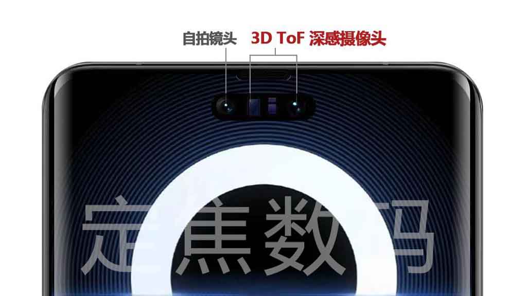
Huawei Mate 60 series is going to be the next big flagship and yesterday, a report claimed it will feature a wide front facing pill shape cutout. The cutout somehow resembles like iPhone 15 Pro (upcoming) but it may be smaller. Another input on this matter says it will house a 3D ToF facial recognition module and a selfie camera.
The phone will also come with a smart capsule interaction, which is a new software capability, of what we’ve seen in the latest iOS devices.
Since the launch of iOS 16, Apple changed the entire notification prompts and animations around the notch in iOS devices. But this tiny change, helped the company to deliver all of those new pill shape notifications to the iPhone 14 without doing too much of the work notch and pill shape devices. I hope you got my point.
Similarly, Huawei might release these new pill shape notifications and interactions for all of its phones without worrying about their screen design.

But the Huawei Mate 60 series could get some special rewards as optimizations. We might see the full potential of these new dynamic animations with HarmonyOS 4.0 when this Huawei phone actually comes out.
Even for now, these additions are looking fantastic and we’ll keep you posted with its upcoming release.


