News
Here are all of the Huawei logo and their stories

Huawei has been the star performer of China, it’s known as the revolutionize various fields of technology, especially in Telecommunication. Aside from its work in tech, Huawei is also known for its logo, which is known widely among consumers and industry partners.
However, the current logo wasn’t the only logo that Huawei had since the start. According to the information, the Chinese tech company has started its journey in the industry with another logo after the start.
The logo has its own story, so let’s get into it.
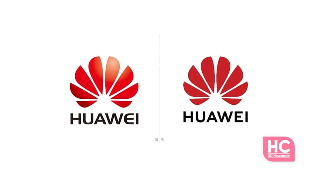
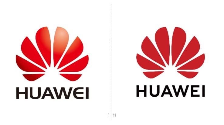
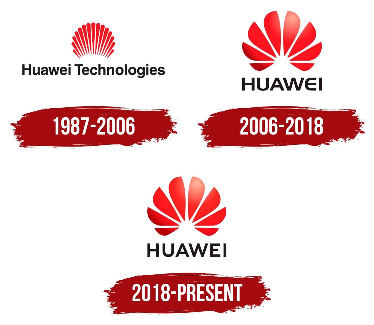
The current version of the Huawei brand logo was adopted in 2018, and before that, the logo has been changed two times.
First:
Huawei was founded in 1987, and the company has been devoted to Chinese countryman enthusiasm. Therefore, the founding members along with Ren want to name the company depending on the devotion to people.

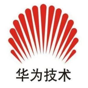
Based on this, the first logo was designed and brought forth. The initial design has 15 red lights and it means “Rising sun and the sunrise in the east”. Later, the logo was being compared with the logo of Shell petroleum.
The first logo also has the label “Huawei Technologies”, written in black letters.
Second:
In 2006, the management decided to carry a major change in the logo and changed 15 red lights into 8 plums with round petals, to form the shape of a chrysanthemum, which is a flowering plant native to East Asia.
In the second version of the logo, the company removed “Technologies” from the brand label and kept only “HUAWEI” to be precise, and adopted a more western look.
The new petal look has its own meaning, according to Huawei, it means we always insist on starting everything from customer needs, insisting on people-oriented, and treating our diversified employees as the core asset of the company.”

Why changed 15 red lights to 8 petals?
Although there are is no official confirmation available on this matter but there are some following roundups available online:
- When Huawei first started its business, it had 15 founding employees. Later, some people left one after another, and in 2006 there were only 8 left, that is, 15 changed to 8.
- Huawei is a communications manufacturer and cannot do without a “twisted pair.” The commonly used “twisted pair” has 8 cores, which correspond exactly to 8 petals.
- Huawei worked 15 hours a day at the beginning of its business, but it was shortened to 8 hours later, which means 15 changes to 8. (This is obviously a bit of a joke.)
- After turning into 8 petals, it is more like Ren Zhengfei’s “Fei”.
Third:
In 2018, Huawei unveiled the third-gen logo, which is simple and plain excluding style from font and gradient from the petals.


