Comparison
HarmonyOS 2 vs Oxygen OS 11: Difference in Settings UI

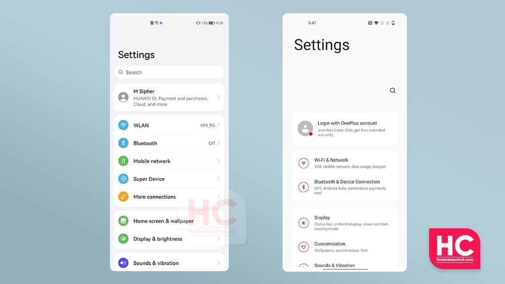
Huawei HarmonyOS 2 presents one of the best user interface designs in the mobile operating system industry. This new mobile software doesn’t only come with new animation effects but new UI elements.
Following a comparison with EMUI 11, Oxygen OS 11 is the next focus of our Settings menu comparison. It’s time that we dive into a head-to-head battle between these two softwares.
For the HarmonyOS 2 vs Oxygen OS 11 comparison, we’ll explore the Settings menu as well as the user experience.
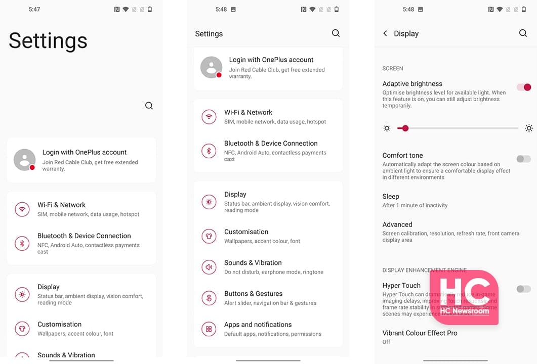
Oxygen OS 11:
Compared to HarmonyOS 2, Oxygen OS 11 carries Red enthusiasm throughout the user interface that looks good but not too perfect. The Settings operations are fast but they lack smoothness.
Also, the UI settings elements have Red-colored icons with outlined architecture. The menu items also have details of a specific menu option along with their corresponding interaction scheme.
The UI effects and transition from one menu to another are very subtle and it’s really good.
HarmonyOS 2:
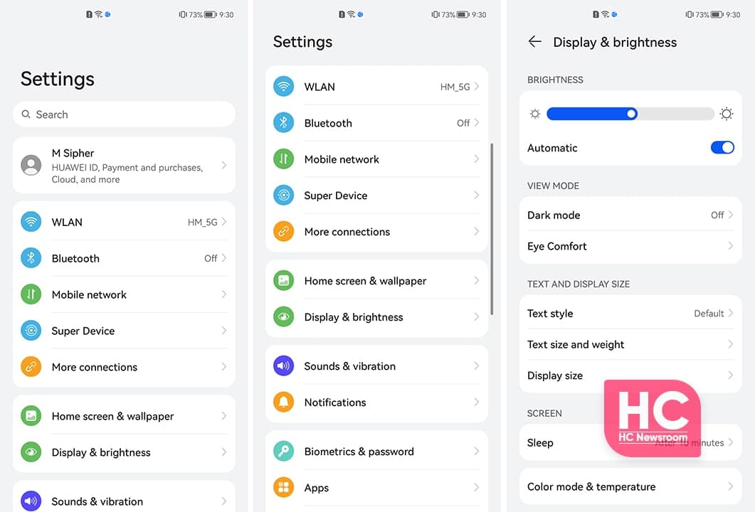
In comparison to Oxygen OS 11, the HarmonyOS software has a very elegant Settings menu, which enables elegant design and section-based menu options approach towards you.
The section-based Settings items provide a categorical view of the UI elements and showcase insights on the features. You can select the features as well as options to strive and move forward with.
The scrolling animation is intriguing to the eye and reflects on the users’ fingertip. We definitely have to mention the icon design and the colorful behavior that catches your attention, allows them to choose the option in a correct way.
The ease of visibility further extends with the new HarmonyOS fonts that increase the overall viewing experience of the HarmonyOS 2 Settings menu. You can see the demo linked below.
EMUI 11 vs HarmonyOS 2:
You can also check our Settings menu comparison between EMUI 11 vs HarmonyOS 2, which is linked below.
HarmonyOS 2.0 vs EMUI 11: Settings UI, Fonts, Icons, Sections and more


