HarmonyOS
HarmonyOS 2.0 Mobile User Interface will change with stable rollout

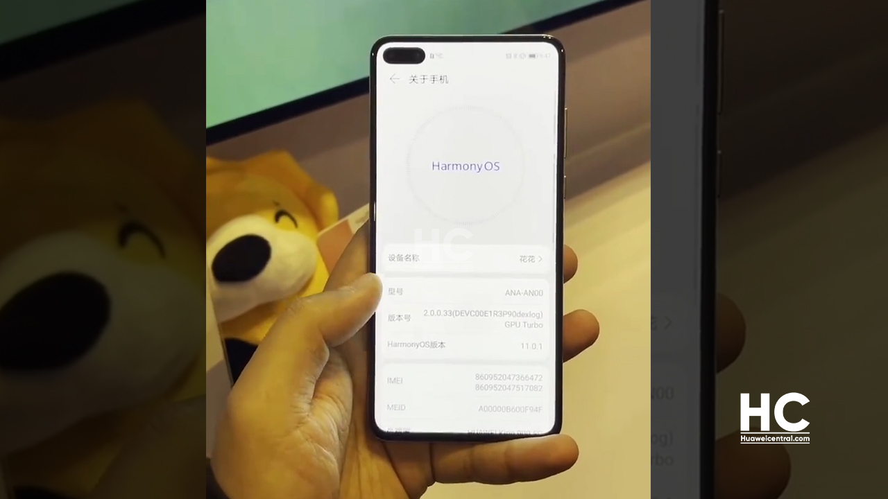
On December 16, Huawei released the mobile developer beta of the HarmonyOS 2.0 (Hongmeng OS 2.0) operating system. Simultaneously developers able to participate in the beta activity and load the beta build on their Huawei P40, Mate 30, and MatePad Pro devices.
By looking at the demo video, most of the people complained that the user interface of HarmonyOS 2.0 mobile beta is almost similar to the exiting EMUI version – EMUI 11.
According to Sina Tech China, the mobile beta of HarmonyOS 2.0 is only to show the distributed capabilities of HarmonyOS. However, the stable version of HarmonyOS will definitely have a new user interface (UI) for smartphones in the future.
This makes sense and we’ve also predicted the same change in the previous reports. It also makes sense that Huawei doesn’t want to reveal all of the features of HarmonyOS 2.0 at once and we’ve to wait for its full release to find out more information.
Wang Chenglu, Software Chief at Huawei Consumer Business Software Department recently said, in the past five years, Huawei has basically replaced the core functionalities of the Android system. From the low-level driver to the hardware abstraction layer, go to the programming framework on Huawei, and so on. Huawei has changed everything that could be changed.
With the use of distributed technology, HarmonyOS 2.0 can be used across different devices in the Huawei device ecosystem. Also, its distributed UI controls can adopt different types of display sizes without the need to recompile the app for different platorms.
At the event, Wang also revealed that top home industry partners including Midea launching products with HarmonyOS this year. In 2021, Huawei aims to install HarmonyOS in over 100 million devices from 40+ brands.
Also, Check:


