HarmonyOS
HarmonyOS 2.0 Dev Beta 3 Features: New quick settings, animations, settings menu, swipe gestures and more
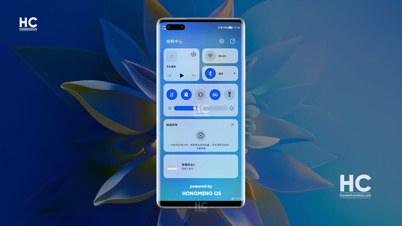
Huawei Mate 40 series, Mate X2 foldable phone, P40, Mate 30, and other Huawei devices are currently eligible to test the HarmonyOS 2.0 under the developer beta program.
Recently, Huawei has started pushing a new software update in the HarmonyOS beta pipeline and proven it one of the most interesting software builds in the entire HarmonyOS 2.0 beta activity because of the new changes it brings to the user interface.
For your information, the new beta software build for the HarmonyOS 2.0 developers brings new changes in the Quick Settings, notification panel, Settings menu, app drawer, system animations, as well as, other parts of the HarmonyOS software.
Everyone smartphone owner definitely wants to know about the upcoming of HarmonyOS and what it has to offer to the consumers compared to the already available operating systems in the market.
Below you can check all of the new features that come with the latest developer beta build of the HarmonyOS and allows us to get more closer to this new Huawei operating system.
Check the features in details below the linked video:
1 New HarmonyOS animation:
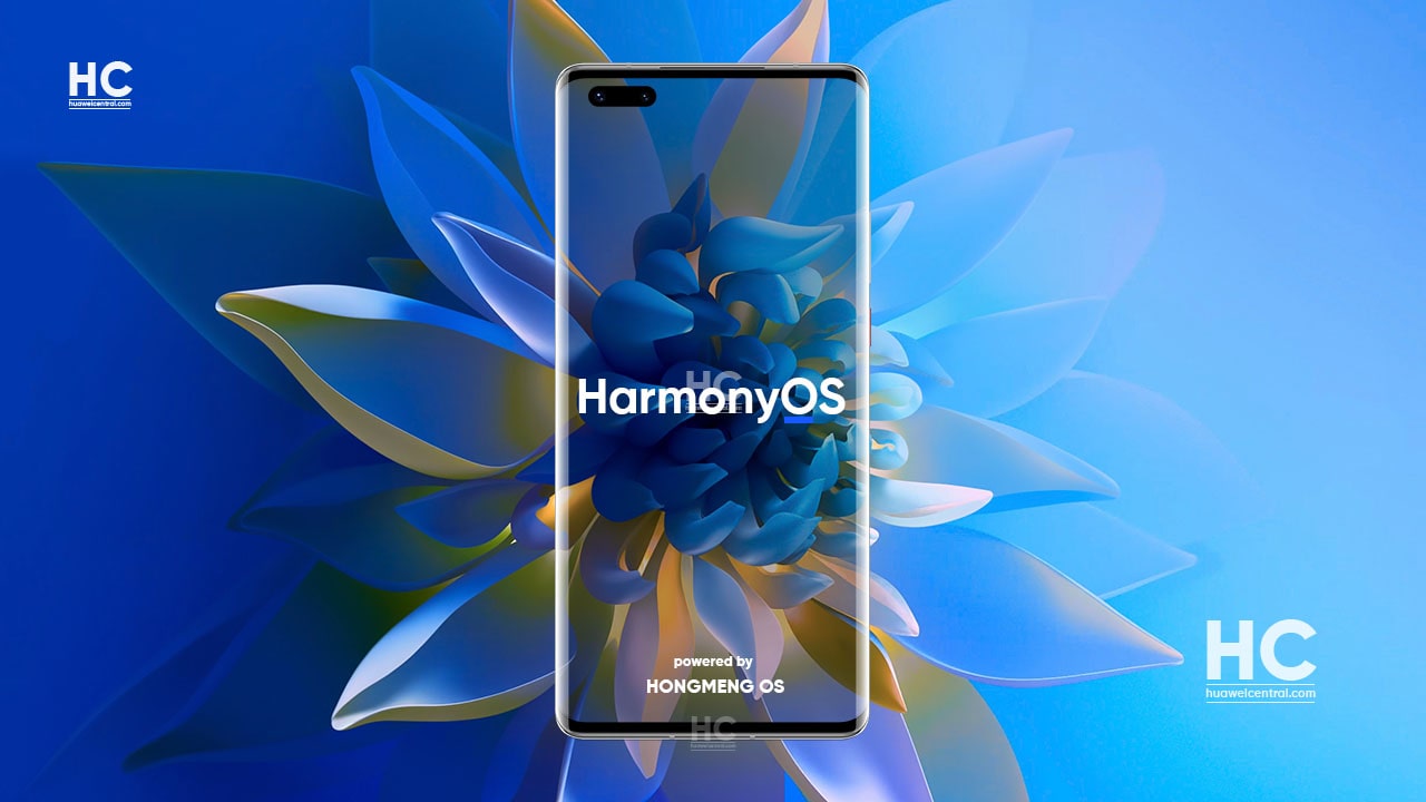
Previous builds of the HarmonyOS have a blank boot screen but with a recent beta build, Huawei has installed a new boot animation that shows the “HarmonyOS” text logo once the device boots up. This entire animation looks way better than the “powered by Android” system startup screen in GMS-powered devices.
2. New home screen decorations:
When the device starts, the HarmonyOS will show you the new subtle changes in the home screen and its elements including on:
- Icons
- Widgets
- App screen drawer
- Drawer animation effects
- Drawer sliders
3. New Card System with round corners:
Compared to the EMUI 11, HarmonyOS brings a new card UI design that has a more clean appearance. While those round corner makes the user interface more intriguing to the consumers and increases the menu elements visibility in the Settings Menu.
Aside from the Settings, this new card design can also be seen on the quick settings panel, Huawei Assistant app, and other system applications.
4. Resizable widgets:
The widget system in the HarmonyOS has something new to show, yes we’re talking about the new resizable capabilities of making the widgets big and small, depending on the space on your phone’s home screen.
5. App transitions:
The apps on HarmonyOS now have new transition effects for opening and sending them to the background. As it feels smoother compared to the last EMUI version.
6. App Icon Swipe Up Gestures:
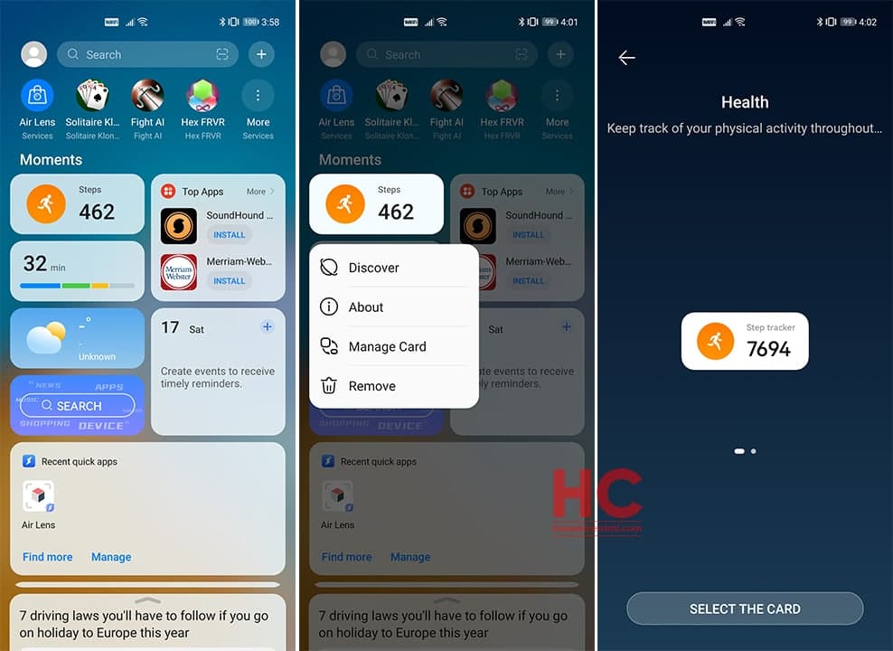
Want to know a more interesting feature? Here comes the app icon swipe gesture. With this functionality, you can swipe from the app’s icon to upwards to view their important information in an instant, each app has its own layout.
Users can swipe from any app to open quick-access info of that particular app. Users will then be allowed to pin that widget on the home screen and get information from the app on the go as a live tile.
7. Camera App Layout:
At the moment, there’s no major changes or improvements have been noted in the layout of the camera app nor on its features.
8. Quick settings panel:
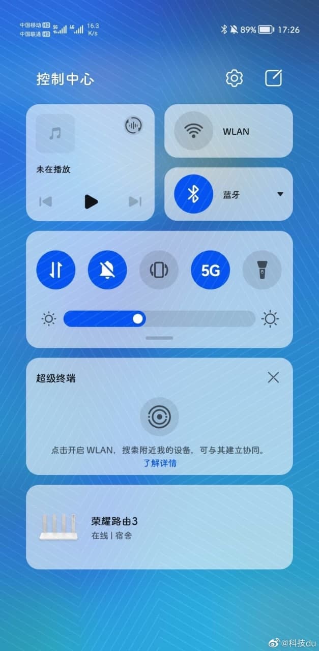
One of the biggest changes in the HarmonyOS 2.0 comes in the form of the new Quick Settings, which has a new design and layout. To be honest, it looks better compared to the EMUI 11.
From the design side, the quick setting panels’ icons have minor changes in terms of their appearance but the entire quick settings now got sections of priority-wise shortcut switches.
For instance, the top section includes, Music Controller, followed by Wi-Fi and Bluetooth Switches.
Below the top section comes the quick access switches that could expand once the user hold and scroll downward. There is also, the smart device control center that keeps a check on your connected smart devices and allows you to manage them from one place.
9. Huawei Assistant:
Lastly, the new design of Huawei Assistant is something that we’ve already discussed, and to be recalled it’s the first indicator of the new changes that are about to come with HarmonyOS and landed weeks ago on the EMUI powered smartphone owners.
The most notable feature of the HarmonyOS includes the new card design and it first appeared in the recent redesign of the card system in the Huawei Assistant app, which we liked a lot.
Devices Testing the beta build complete list:
Last month, Huawei opened HarmonyOS 2.0 developer beta for more Huawei devices including the Huawei Mate 40 series, Huawei Mate X2 foldable phone, Mate 40E Pro, and More. As of now, the company has expanded the HarmonyOS 2.0 beta program to the following models:
300 Million HarmonyOS devices in 2021:
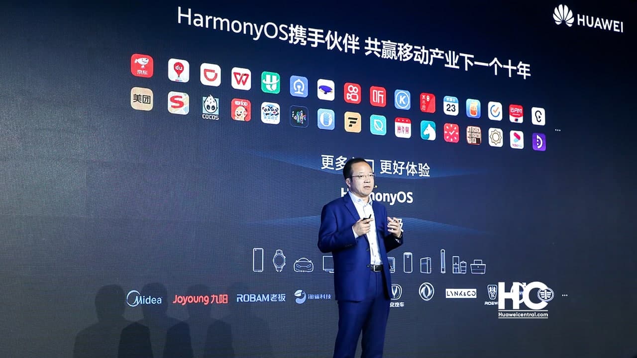
According to Wang Chenglu, Huawei Consumer BG Software Engineering Dept President and AI and All-scenario Intelligence Business Unit Director, Huawei aims to install HarmonyOS in 300 million devices in 2021. According to the information, around 200 million devices from this figure will count as smartphones consisting of both new and old models.
The rest of the devices includes tablets, smart wearables, IoT devices as well as third-party devices powered by HarmonyOS.
Estimated launch:
The previous report reveals that Huawei will open the HarmonyOS beta for more public beta testers in June and the company will likely introduce the stable build somewhere in June or July.

