Android
Google Play Store gets some visible changes in the My Apps section

Recently, Google has released redesigned the Play Store that removes the hamburger size menu and moved most of its menu entry to the account switcher.
But this is not the end, Play store is testing another new layout of the “My Apps” section at adds an overview page with more information. Last week, the screenshot has a surface online but it’s not an impressive one.
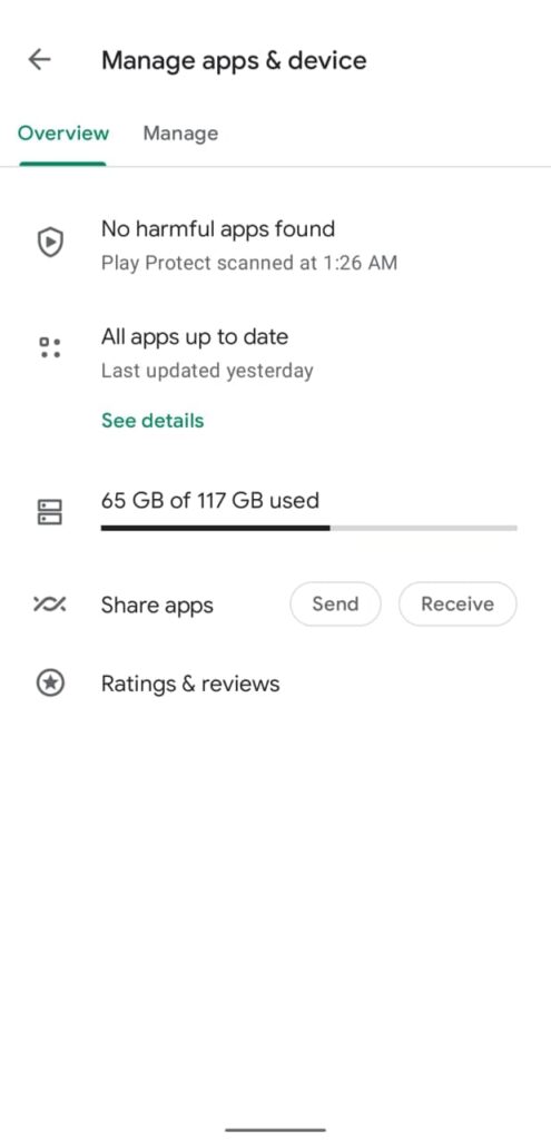
Recently, Reddit users shared an image of the “Manage apps and device” section in which there is an overview page that was earlier known as My Apps for years. Additionally, most of the tabs from the old interface like updates, installed, Library, and more removed.
Instead of all these, there are only two pages that are Overview and Manage. The default overview page lists a few menus and shows about Play Protect, used storage, your rating, review, and options to share apps but if want to know about the app update this section is useless.

In terms of an app update, only a small entry is here in the Overview section that shows “All apps are up to date” and additionally, the option to see details is available here. A Reddit user also shared an image of pending downloads sections, where currently no pending apps are there.

This was not the first when this design appears in front of us but it was once popped up in 2020 and after a while, it disappeared for most people. Now, it is back again that shows Google is getting more serious about this redesign.
(Via)


