Google News brings in sleek UI design and features with 20th anniversary update
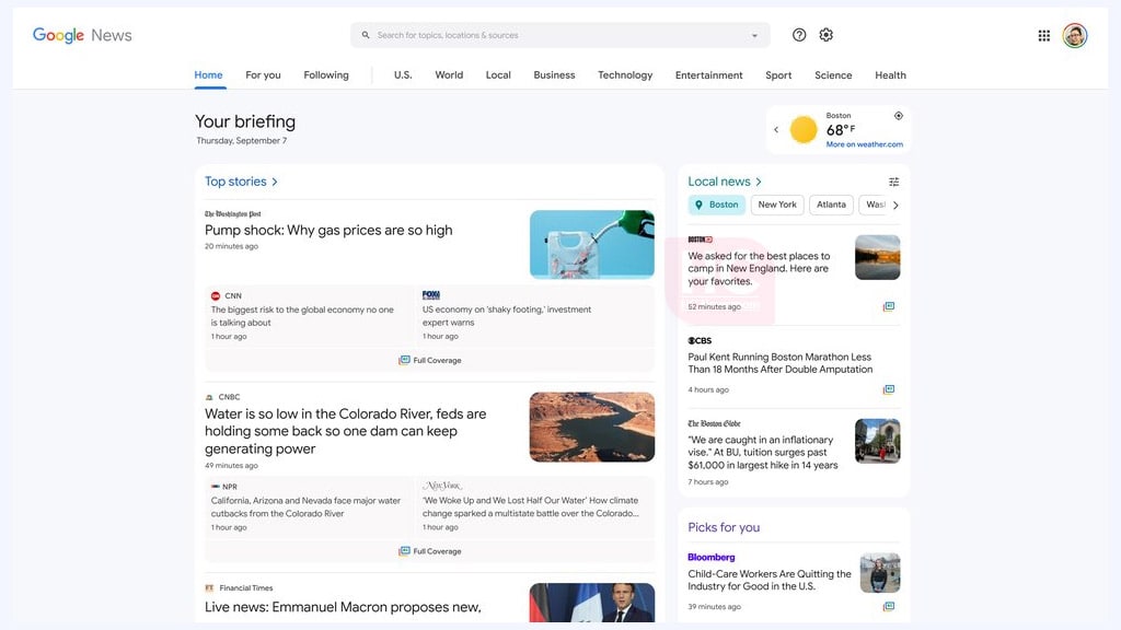
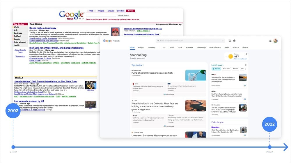
Marking the 20th anniversary of its launch, Google has brought in a sleek user interface design and a number of new features for the Google News platform. So, what’s new with this Google News 20th anniversary update? Let’s find out.
New UI Design:
Google has confirmed that Google News is now getting a new user interface that is based on readers’ feedback. The new user interface is easy to catch and allows you to pick the content you want to read.
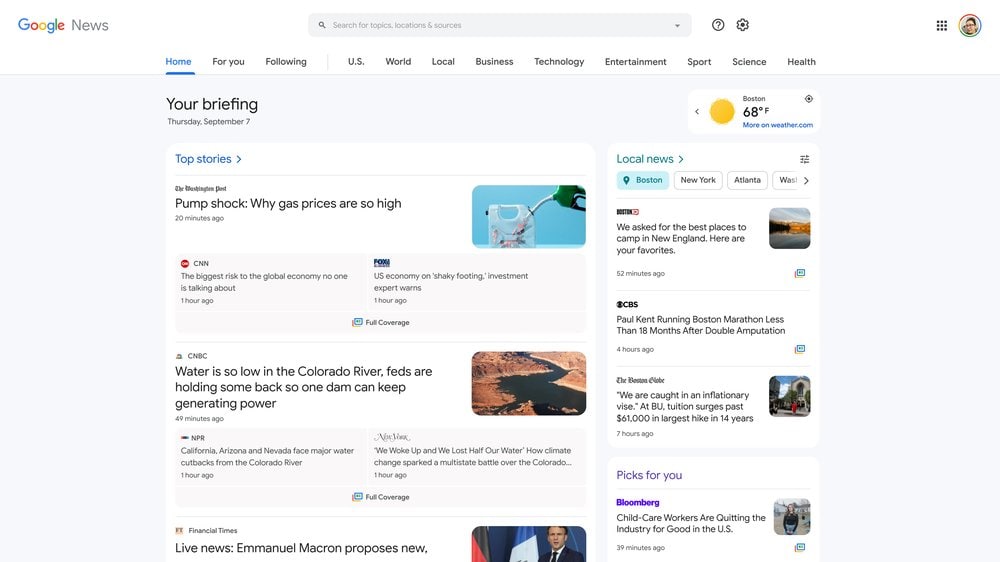
Visting an example, the local news sections are now moved to the top, which makes them easy to find. You can also filter buttons to filter searches in different sections as well categories as well as localities. Google has also mentioned the carousel that has changed the way that we see the news on Google Newsstand.
New Features:
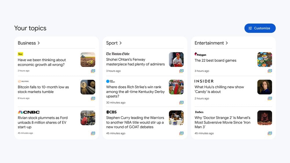
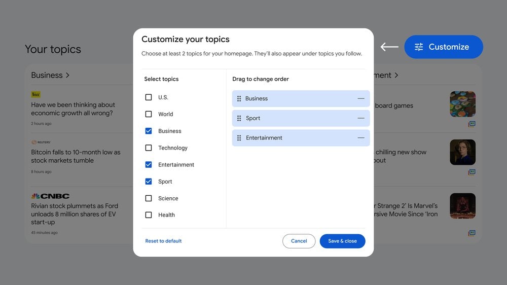
Google News’ 20th-anniversary update aims to improve content customization for topics that appears on the screen. The new feature allows you to scroll and click through to the stories that interest you the most.
To make it work, Google News will let you add, remove or reorder topics by just clicking on the blue “Customize” button on the right corner of the topics section screen.
There’s more in the search result information that will enable you to check more information about that published article. You need to tap on the three dots on the right of the article to know where it is coming from.
Looking back:
In addition to the new look, Google has also looked to the past and the evolution that has been made in the last 20 years. This huge readers marketplace has started its journey by gathering links in real time, grouping articles by the story, and ranking stories from publishers worldwide.
The tech maker has promised to add new features with upcoming updates and bring more for the readers.
Also, Read:


