Google Apps
Google Meet Web getting renew design, will be available in June

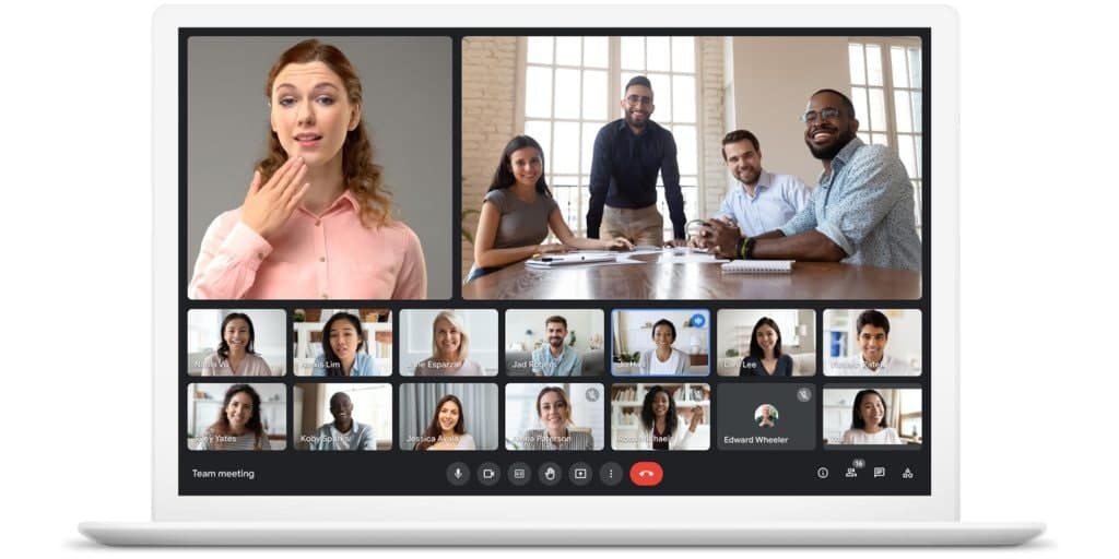
Last month, Google announced the new UI design for the video conferencing app – Google Meet on the web. The additional changes include a new UI design, new features, and background changes.
However, last time Google didn’t inform how much time it will take to roll out these features, saying that it’ll come soon. Users are eagerly waiting to experience these functions on Meet.
According to the latest information, the first batch of these new features are started to roll out and will gradually expand for everyone in June.
New Feature and Changes:
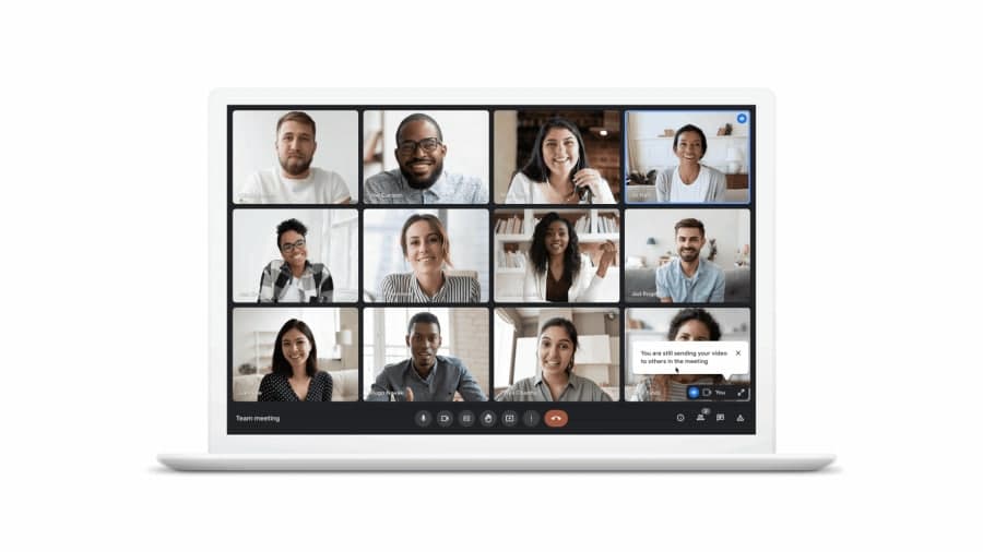
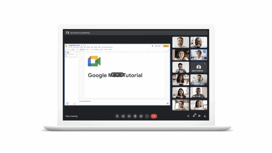
Talking about the new exciting feature with more user convenience includes key controls on the bottom bar, various buttons to prevent the accidental camera on/off, pined content, and the ability to adjusting chats list or attachments.

Furthermore, users can adjust the floating pictures and are able to resize reposition or hide it. The participant, who is giving a presentation or asking questions, or giving suggestions will is in a visible blue colored border.

Rolling out Shehduled:
When Initiated:
This new UI redesign update is rolling out since Monday, May 24 on limited personal and workspace accounts across the globe.
When Expand:
The company has announced that it will begin appearing for “scheduled release” enterprise domains on June 1. Until then users will have to wait.
When Available for Desktop Users:
For the desktop users of Google Meet, it will also come to Meet conference rooms in the coming weeks. Google will soon make a way to reach this for the Desktop users.

Found Issues:
The users who already get this new version encountered some distribution in it and reported them. The listed issues are mentioned below:
- Missing videos
- Incomplete Captions
- Mirroring effect
- Flickering on the presented content on Chrome browser
- Blue outline is occasionally on a non-speaking participant
Moreover, users can solve these issues using various ways for the moment but a permanent solution is yet to come. While screen sharing, sharing a tab instead of a window or entire screen, and restarting the Chrome browser might help you to solve this problem momentarily.
However, the users who already get this new updated UI design can switch from the new look to the previous look until the 10th of June from the pre-call greenroom. After that, this new UI will become inevitable for all the consumers of Google Meet.
(Source – 9to5Google)


