EMUI
EMUI 12: Minimalist User interface design

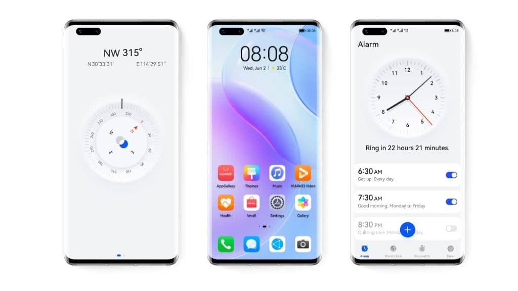
Huawei has started to rollout EMUI 12 software updates for eligible devices and the company is bringing a number of new features for the consumers. However, any major update has at least some changes in the user interface. Therefore, the company is bringing a new Minimalist design in the EMUI 12 update that you’ll love to see.
In terms of the user interface, EMUI 12 Minimalist user interface design could be taken as a major upgrade compared to the EMUI 11. If we compare further, the software interface is directly inspired and looks identical to HarmonyOS operating system that is currently limited for Chinese consumers.
Aside from these, we’re here to explore more about EMUI 12 Minimalist design algorithm that Huawei has brought in.

Minimalist Design:
The first thing to mention – depth sense in the user interface that brings a new kind of feel in the entire UI that the user looks and feels during the interaction.
These changes reflect directly on the user interface that looks realistic and provides a subtle 3D effect of the onscreen content.
The colors have also been revamped through these changes and boast a refined look that is clean and increases visibility for your eyes. Meanwhile, the perfect use of black and white colors is thematics is perfect.


