EMUI
EMUI 11 vs HarmonyOS 2: Changes in the Quick Settings

Huawei EMUI 11 has the most dynamic quick settings panel in the entire EMUI series. EMUI 11 comes with new subtle UI elements such as notification panel icon toggle or switches. Once a user taps on the icon, the user sees feedback as a live animation.
The live status in the EMUI 11 software system creates a more interactive user experience and is appreciated by the consumers.
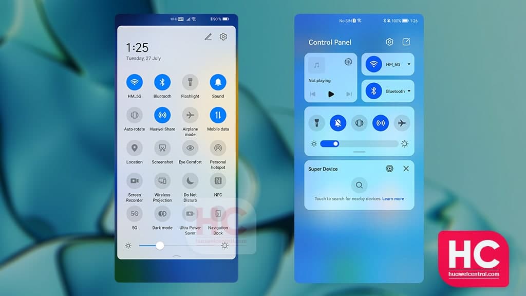
However, HarmonyOS 2 comes with a brand new control panel that is a combination of different features including:
- Shortcut switches
- Super device
- New layout
- New Widgets
So, an EMUI 11 vs HarmonyOS 2 makes quite a sense. Therefore, it’s time to take look at the EMUI 11 vs HarmonyOS 2 quick settings panel comparison.
EMUI 11: Quick Settings
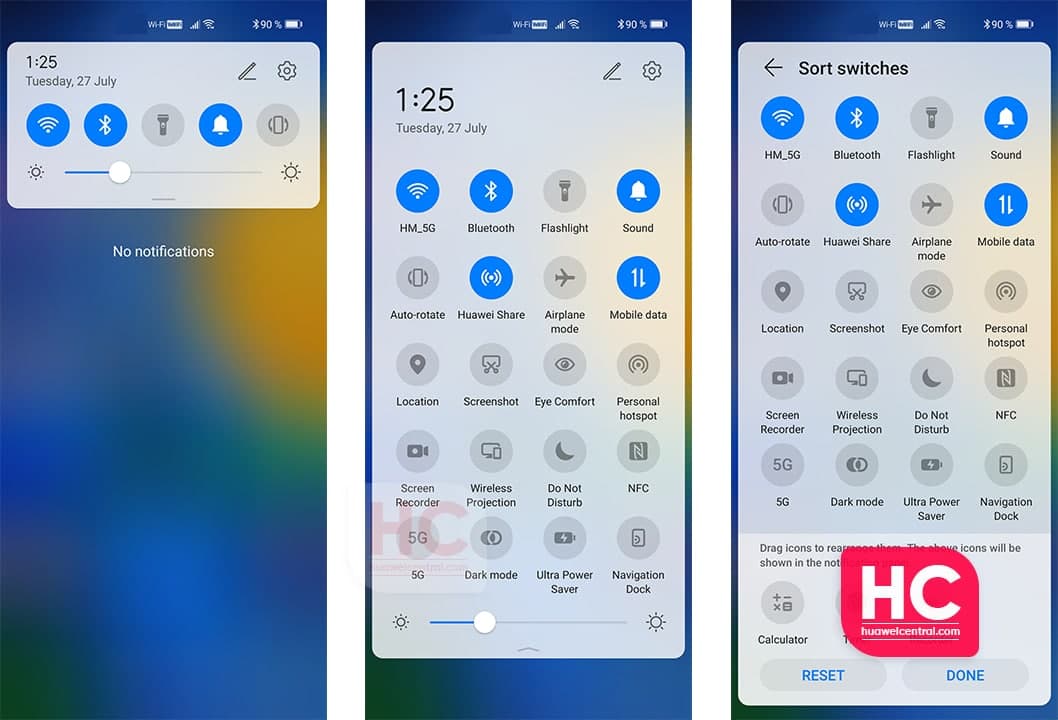
Starting with the former, users of EMUI 11 phones requires to swipe down from the top to reveal the quick settings panel.
The panel first reveals the notification center, by further expanding you’ll see the full quick setting section with quick access switches. Users can also add or remove the quick access switches with the edit option.
HarmonyOS 2: Control Panel and Notification Center
HarmonyOS 2 comes has different sections to access – the control panel and the notification center.
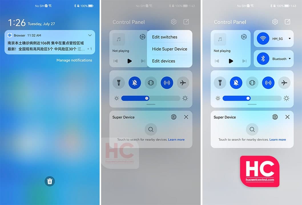
First, let’s move towards the notification center, which you can open by swiping down from the top left corner of the display. Here you can see all of your active notifications.
Users will have to swipe down from the top right corner of the display to access the control panel. Once opened, users will find out three different sections consisting of:
- Media controller
- WiFi and Bluetooth Management
- Shortcut switches
- Super Device
- Smart Devices management
The Control panel also allows you to manage your Control Panel with different options such as layout of shortcut switches and more.
Also, the translucent background provides increase the aesthetics of the entire Control panel as compared to EMUI 11.


