Comparison
EMUI 11 vs EMUI 12: Control Panel and Quick Settings

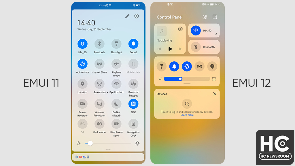
EMUI 11 is a revamped version of EMUI 10.0 and 10.1 and it comes with substantial improvements over the predecessor. However, EMUI 12 is something new and we’ll conduct a comparison series between EMUI 12 and EMUI 11 before EMUI 13 comes out. For this, we’ll first look into the changes that have been made to the EMUI quick settings or control panel and check out the differences.
Time to dive in.
EMUI 11: Quick Settings
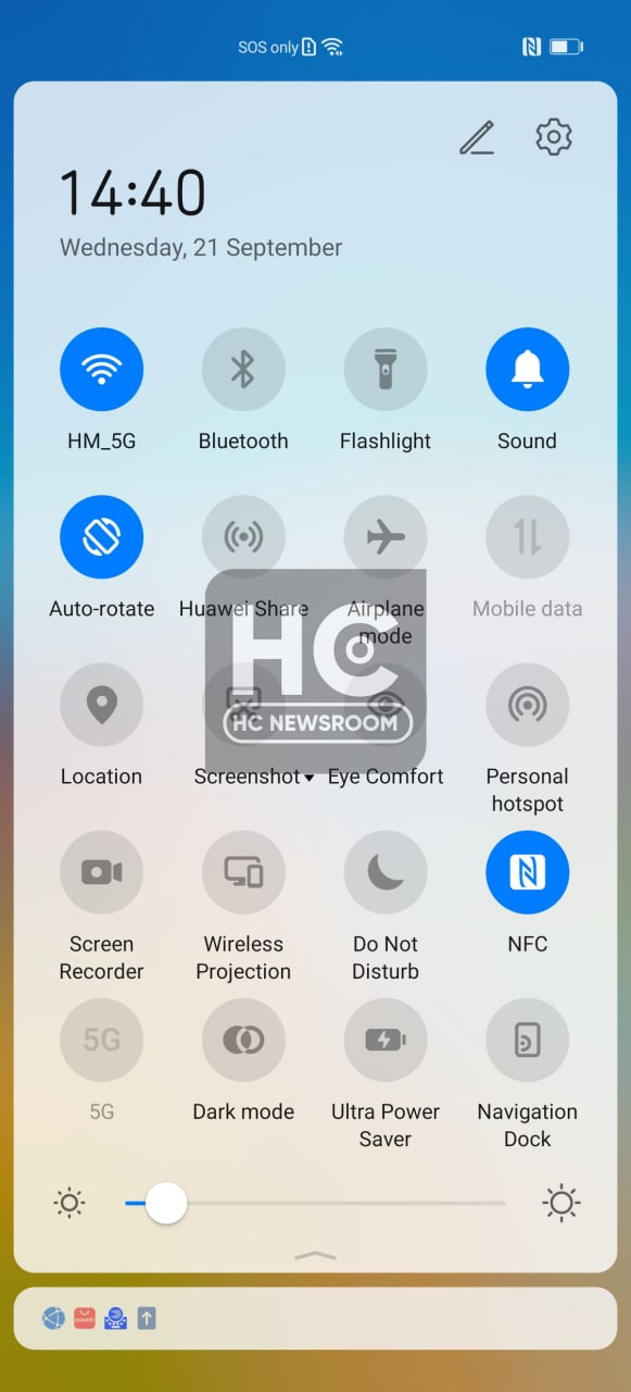
EMUI 11 quick settings have the traditional quick access icons with a switch feature, which you can enable or disable with a tap. Other than that, you can also change the brightness level through the slider.
Furthermore, the notification panel is attached to the quick settings. Similar to the last version, the EMUI 11 also comes with various customization features to add/remove icons.
The panel has a soft background color that helps you differentiate between the icon and the background.

EMUI 12: Control Panel
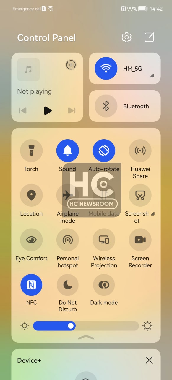
EMUI 12 comes with a brand new Control Panel, which is a combination of various services in one place. The Control panel includes a media controller, and smart device manager that helps you connect and control devices such as tablets, FreeBuds, and Smartwatches.
That’s not it, Huawei has retained the quick settings icons from EMUI 11 and added them inside the control panel.

The EMUI 12 control panel has a better appearance with lots of new features. On the flip side, you can edit the switches or disable the smart device panel as per your preference.
We’ll soon bring you the next comparison, until then stay connected.


