EMUI
EMUI 10 public beta for Huawei P30 and P30 Pro starts in China
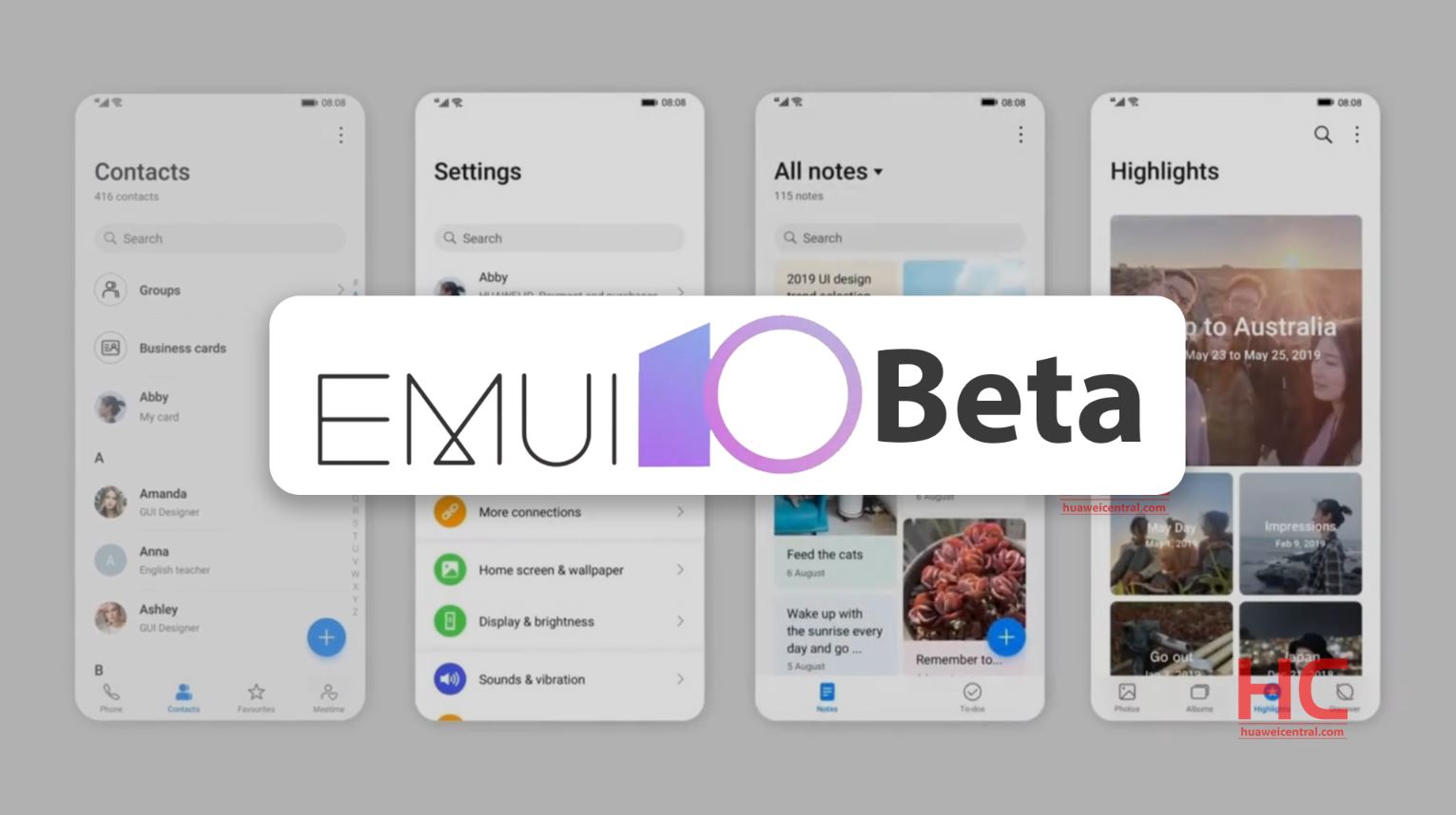
On September 5, Huawei started internal EMUI 10 beta program for Huawei P30 and P30 Pro in China with limited recruitment of testers. And on October 17, the company will start the public phase of EMUI 10 beta for the same devices.
Here are the Huawei P30/P30 Pro models adapted for this test.
P30:
ELE-AL00
ELE-TL00
P30 Pro:
VOG-AL00
VOG-AL10
VOG-TL00
These models require to be updated on build version 9.1.0.193, user can check their build version by going into Settings > System.
Also, before upgrading to the beta version, we recommend users to back up important data to avoid any data loss.
Note: This EMUI 10 beta recruitment is only for Chinese consumers.
Interested readers can check the EMUI 10 beta availability for different countries here – EMUI 10 Beta for Huawei P30 and P30 Pro: List of countries
Compared to EMUI 9.1, Huawei has made some significant improvements in EMUI 10.0‘s user interface, design as well as user experience. And we’re here to discuss those changes and additions.
MAGAZINE STYLE UI:
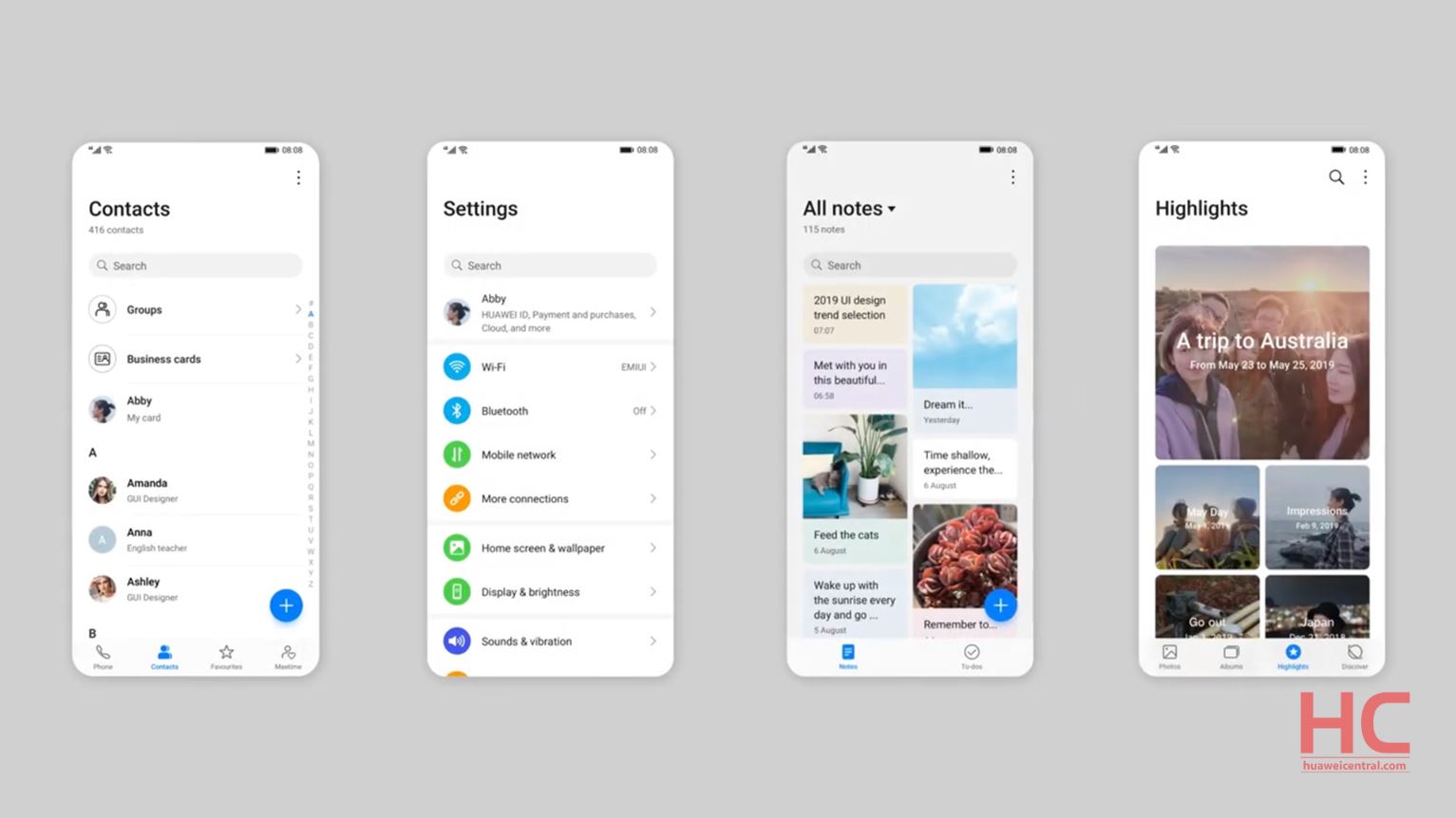
The new Magazine Style introduced in EMUI 10 organizes the screen similar to a Magazine including the Headline area, White space, Grid system, and Highlights of the story. And allows the layout to create a balance between interactive and informative content.
The effect of this whole style adaptation can be seen on the Settings menu, Contacts, Notes, Notification panel and other parts of the UI.
MORANDI COLOR:
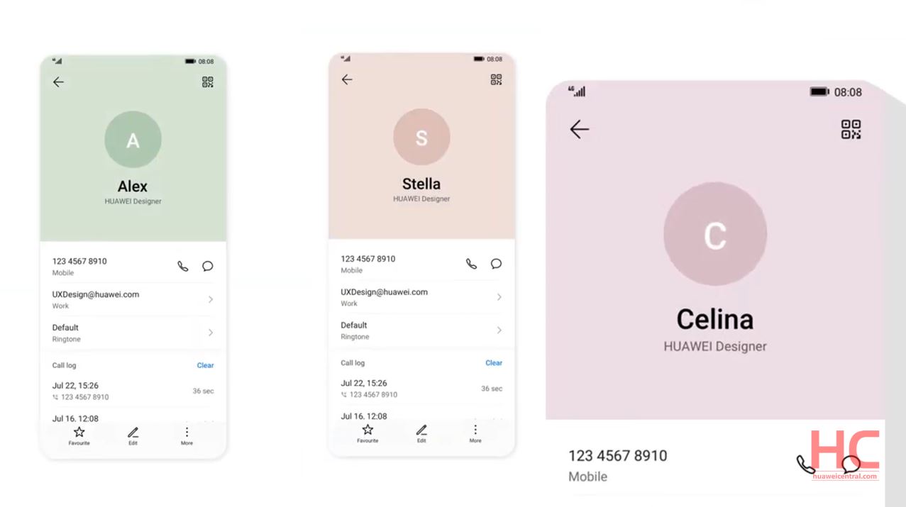
The EMUI 10 now added a two-level color scheme for the top (information) part and the bottom (interactive) part of the display. The new color style will be applied to the top part and is called the ‘Morandi Color System’ derived from the famous Italian painter Giorgio Morandi.
There are a total of 6 Morandi colors integrated into the contact details, NotePad, Gallery and other parts of the Interface. According to Huawei, the addition of these new colors makes the overall experience more elegant, intriguing and interactive.
GOLDEN RATIO ICONS:
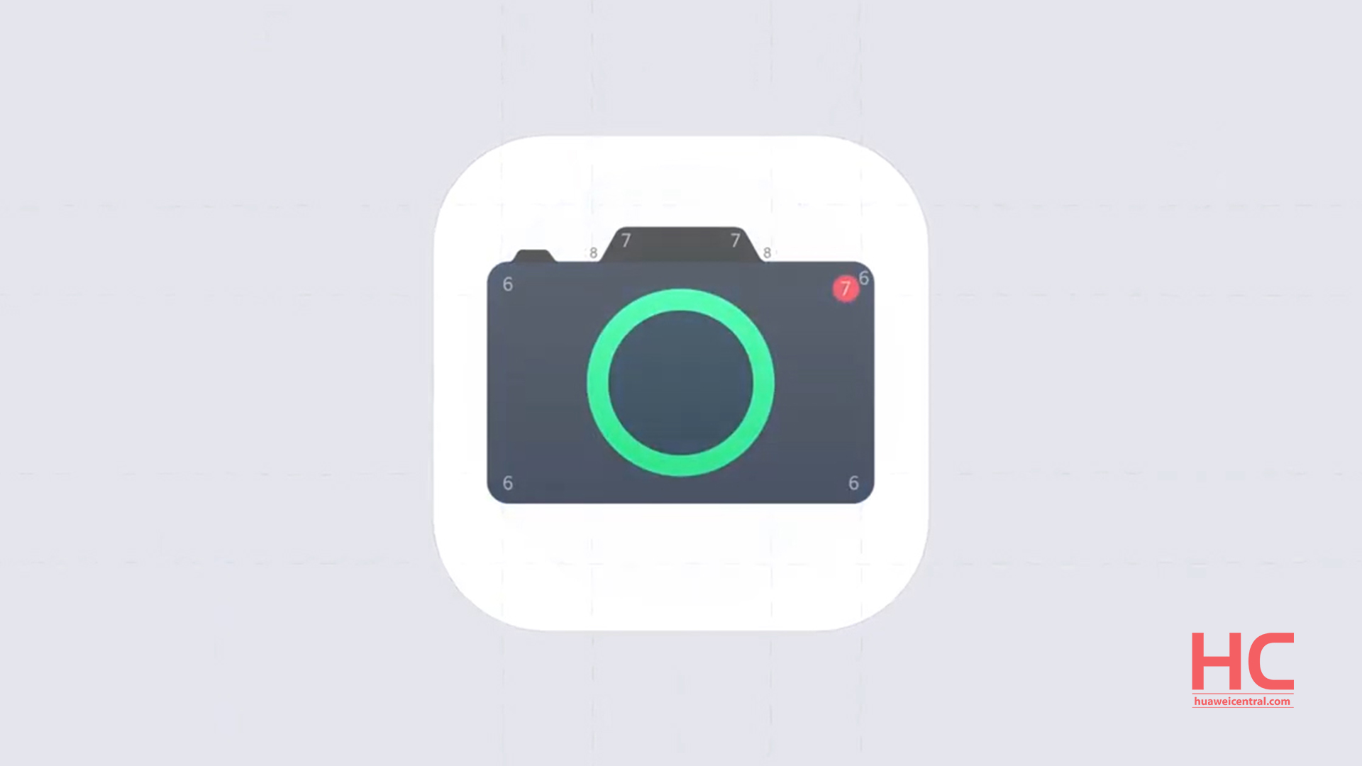
To make the interface more elegant, the Icons design has received a golden ratio makeover with more rounder shape and sharp appearance.
COLORFUL AOD:
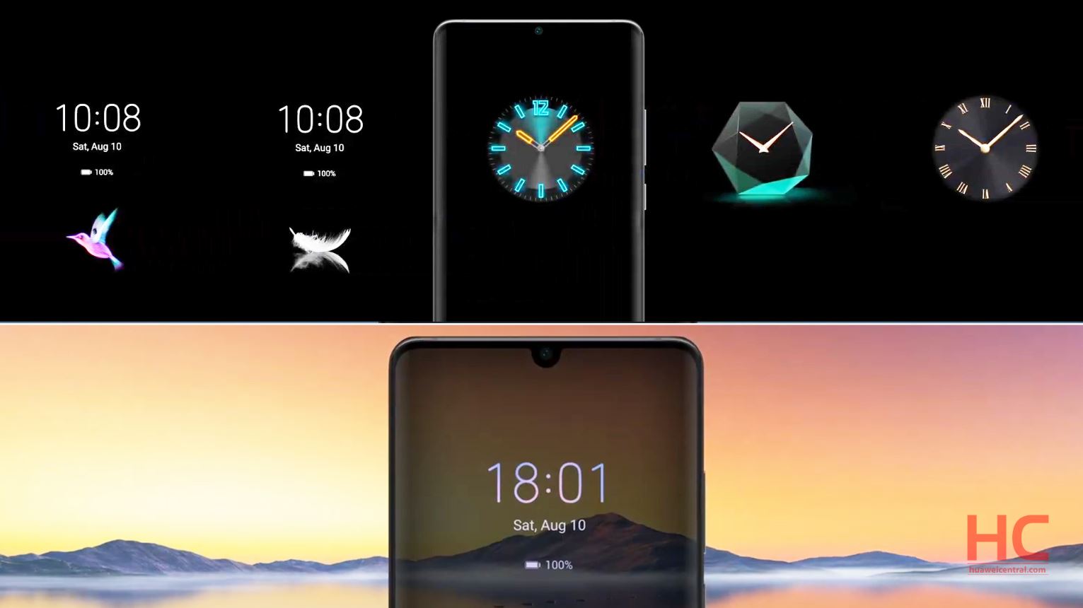
In the previous version of EMUI, there was only white color available for Always-on Display (AOD) but with EMUI 10 now it added color schemes and new widgets options.
REDESIGNED CAMERA APP:
The camera app UI is also redesigned for better and easier camera operations including the actions between modes switching, toolbar and font style is improved compared to EMUI 9.1.
NEW ANIMATION EFFECTS:
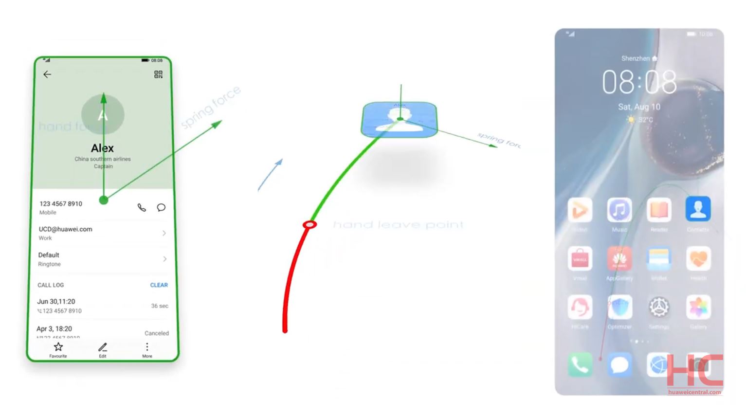
The user experience now comes with more smooth and dynamic animation effects that can be experienced through hands and eye combination. The feature for UX improvement includes elastic touch, physical curve movement, and new transition effects.
DARK MODE:
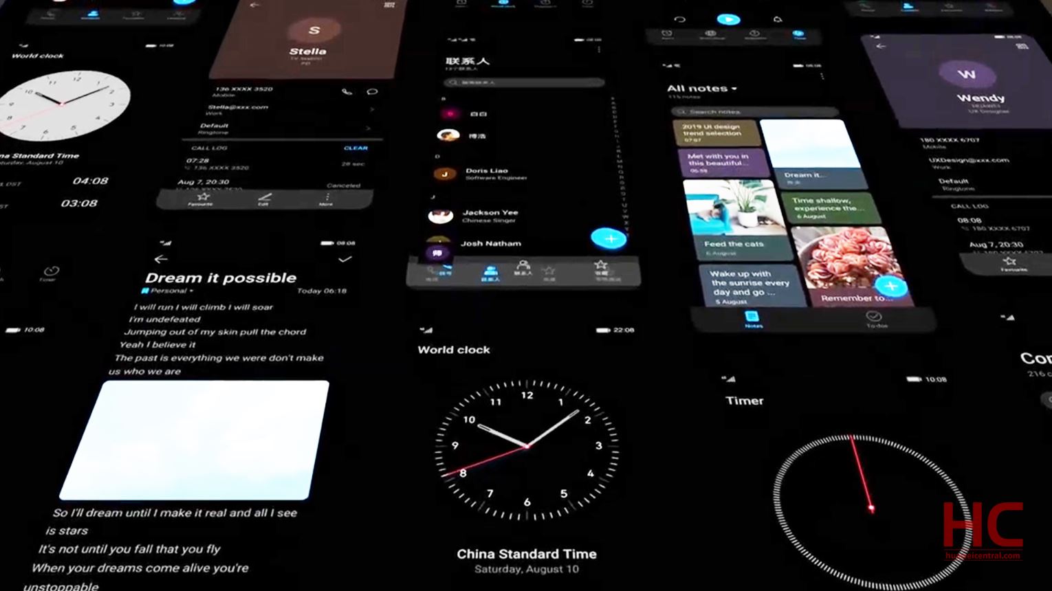
The dark mode that optimizes both color contrast between texts and dark backgrounds as well as the color of texts and system icons, which leads to visual comfort.
These are the key features and changes made to EMUI 10, and we’ll cover the whole set of addition when the EMUI 10 goes stable.

