EMUI
EMUI 10: Magazine Style redesigns the user interface

With EMUI 9, Huawei started to shift its focus on aesthetics of the user interface and with the introduction of EMUI 10 the company has pushed this concept to the next level.
EMUI 10: Colorful Always-On Display (AOD) with clocks styles and more
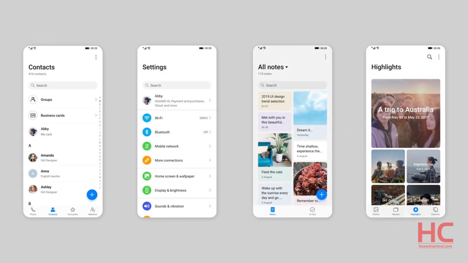
The new Magazine Style introduced in EMUI 10 organizes the screen similar to a Magazine including the Headline area, White space, Drid system, and Highlights of story. And allows the layout to create a balance between interactive and informative content.
In work, the whole user interface is based on Artificial Intelligence (AI) algorithms that analyze the layout of the image, automatically compute the focus position of the image according to the different center of gravity of each picture, and then works out the best location to show the text in the picture based on its preference. So the caption could display more content without blocking the key element of the photo.
The effect of this whole style adaptation can be seen on the Settings menu, Contacts, Notes, Notification panel and on other parts of the UI. Also, the system animations are now more fluid compared to the previous version.
This is one of the key features of EMUI 10, and we’ll cover the whole set of addition when the EMUI 10 beta programs officially begin.


