Comparison
Dark Mode Comparison: EMUI 12 vs Stock Android 12 vs One UI 4.1 vs HarmonyOS 2 vs iOS 15 vs MIUI 13
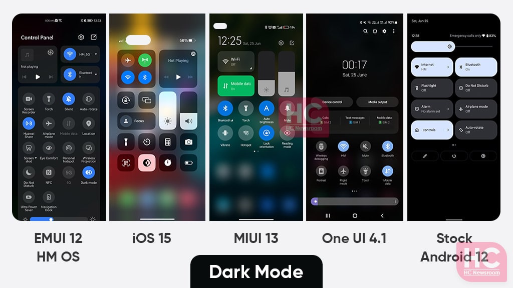
Dark Mode is a feature that we all love to use and it nowadays works on all major smartphones but appears a bit different. Therefore a comparison between Huawei EMUI 12, HarmonyOS 2 vs Stock Google Android 12 vs Samsung One UI 4.1 vs Apple iOS 15, and Xiaomi MIUI 13 for dark mode feature has been arranged to see the changes these softwares bring to the most common parts of the user interface.
Dark Mode:
Dark Mode is a feature that is now available as part of Android, HarmonyOS, and iOS software. The feature helps you to apply a darker color scheme over the light interface to prevent eye strain in low light conditions. On the flip side, the dark mode also saves battery.
What are we gonna do?
Below, we’ll examine each of the smartphone software in their dark mode for the given part of the user interface:
- Quick Settings
- Settings Menu
- Dialer
As we use them the most in our day-to-day operations of smartphones.
Without further due, let’s begin our Huawei EMUI 12 vs HarmonyOS 2 vs Stock Google Android 12 vs Samsung One UI 4.1 vs Apple iOS 15 and Xiaomi MIUI 13 dark mode comparison.
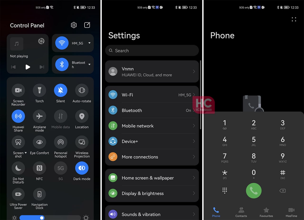
EMUI 12:
In comparison to the last generation, EMUI 12 has good dark mode effects throughout the user interface, the use of dark gray and subtle black looks amazing. The use of light color icon background is really helpful and doesn’t shade much of the contrast if you look over them. Unlike the Control Panel shortcut switches, Huawei has tried to keep the user interface adequate contrast, which makes it very easy to adapt for long hours use case scenarios.
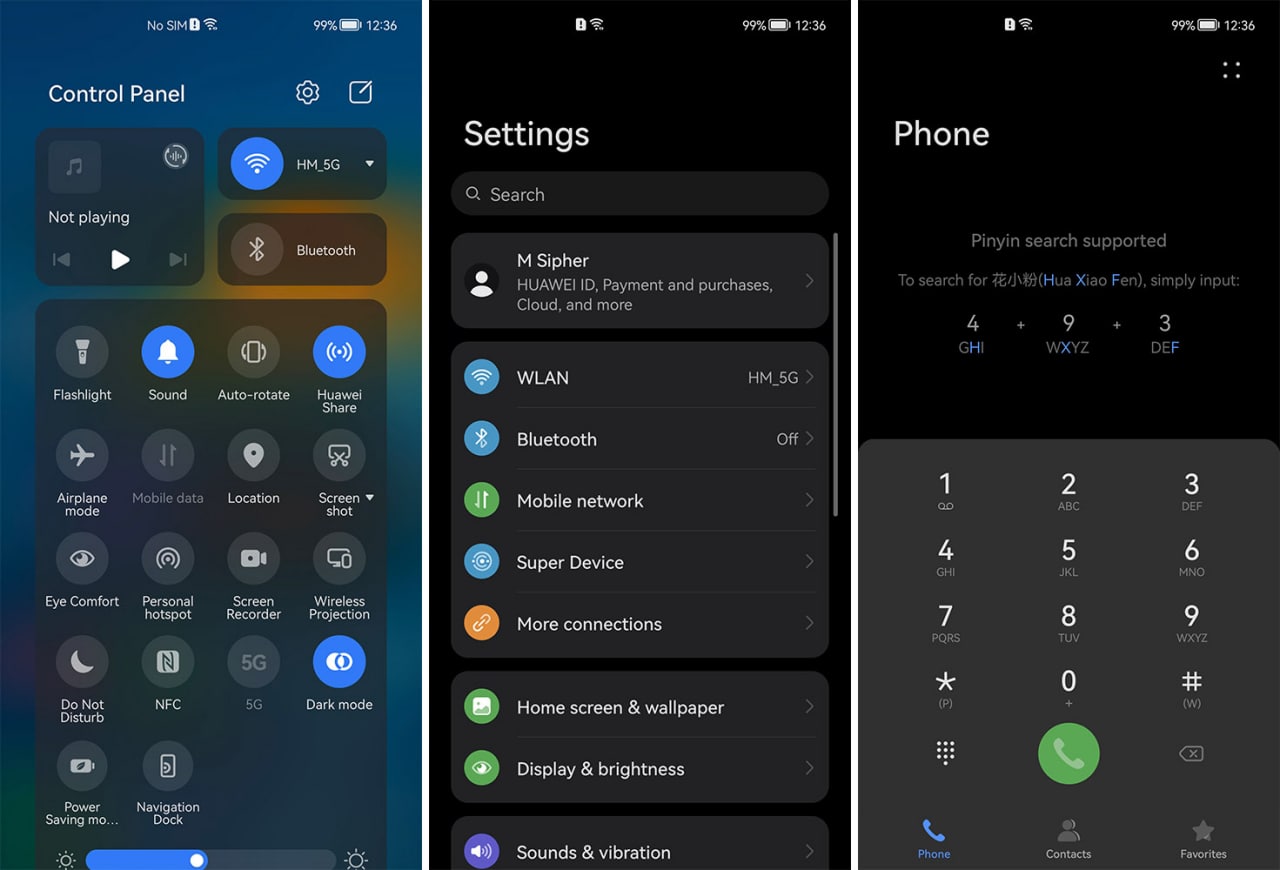
HarmonyOS 2:
The user interface used in EMUI 12 is derived from HarmonyOS 2.0 and they both are identical. check the screenshot below.
Stock Android 12:
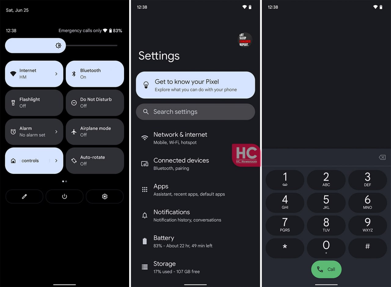
Stock Android 12 has brought a lot of new changes in the user interface, quick settings tile system, and material you design. The user interface is surely intriguing and easy to navigate but by default, the quick settings tiles on the stock Android 12 maintain dark mode. Once enabled a dark gray color is applied to the Settings menu. Moving on, the software uses Google’s Phone app’s dialer, which is also used by Xiaomi in MIUI 13. The overall look and feel of the Android 12 dark mode is satisfying. Yet, everyone is free to try the Material you dynamic theme for maximized user experience.
One UI 4.1:
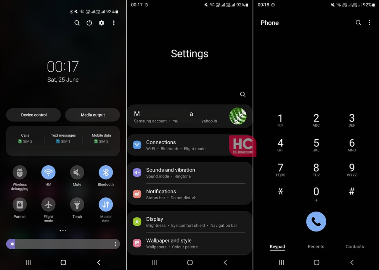
Samsung has been one of the best players when it comes to the dark mode features, the phone maker has introduced this feature on One UI, even before it came by default on the Android project.
The One UI 4.1 has further enhanced the accuracy and the color balance between foreground and background colors in the user interface elements. You will find these changes throughout the user interface.
Such as the Settings menu, you’ll find the shape of the background used in the menu items feels encompassing with the icon as well as the text label. Meanwhile, the use of a high tone on the dialer is perfect to know which button you are pressing to dial your calls.
The overall appearance of the Samsung One UI 4.1 dark mode is comfortable to the eye and it deserves praise.
iOS 15:
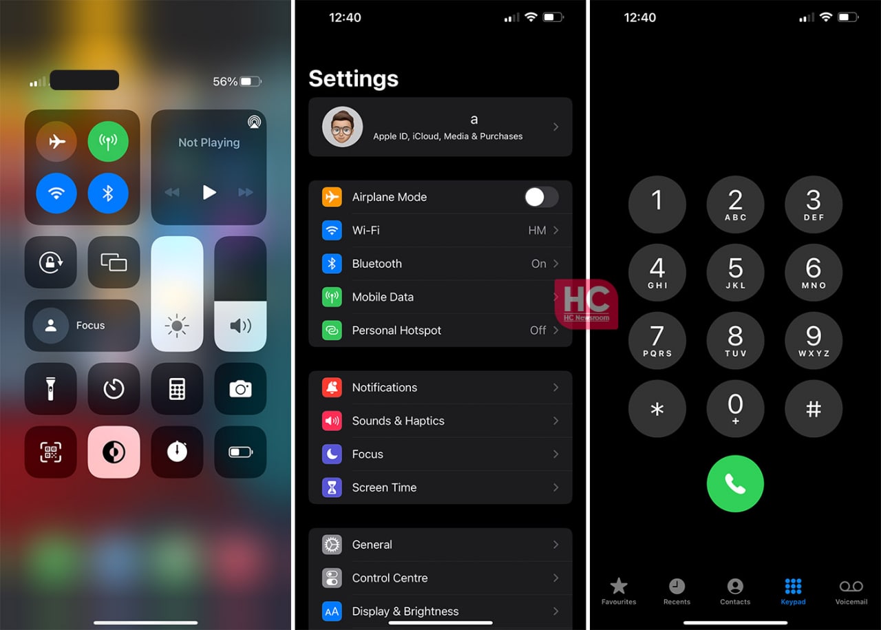
In iOS 15, Apple has kept the control center sleek, which looks the same once the dark mode is enabled or disabled. Yet, the translucent background changes along with the wallpapers once you apply the dark mode to the phone.
Moving on, iOS 15 has brought in the round shapes in the background of Settings menu options, which is a nice touch to look in dark mode and had a sharp appearance in the predecessor.
The color in the icons is also crafted with care as they remain the same in the light theme.
Despite its short search screen, I like the way, Apple has designed the round number pad on iOS, it is still, one of the best dialers that looks simple and elegant in dark mode.
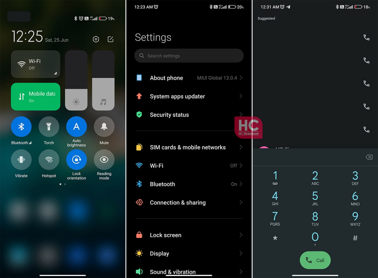
MIUI 13:
The dark mode feature on MIUI devices looks decent. Once you tap on dark mode, the phone tries to maintain the color composition and it seems like it is fighting to showcase the changes from the light theme.
The appearance of MIUI 13 dark mode is not supported by its font system, which is a kind of a bummer. As mentioned above, the software is keen to use the Google phone app on the global market, which is a good choice to go with for phone calls.
The overall look of MIUI 13 is decent but not good nor above.
