News
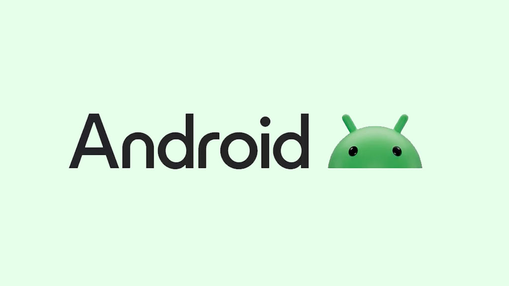
Android logo gets new 3D Robot and text style

Google has recently made some changes to the Android logo, which includes a new 3D robot and styled “Android” text. It’s revealed that these changes are made under the new brand identity campaign.
The new Android logo with a 3D robot is now active in promotion content published online including an app safety awareness video on YouTube.
This new graphic was first spotted by 9To5Google and explained the changed elements. According to the information, the Android text now has a capital “A” in the logo text. Meanwhile, letters including “n” and “r” are rounded even further.
The current Android logo has a flat bot head, which is painted in bright green color. Yet, the new identity wants to do something different, leading us to the new 3D robot visual.

Implications
Google also stated this matter, saying that the company has started to expand the new Android brand identity on various platforms including both digital and offline advertisements. The Android maker also mentioned that this logo will appear even more soon.
Eventually, we may also see this new brand logo on the “Powered by Android” boot screen. Also, this new logo should debut with Android 14, which may make more sense than before.

History
Since its launch in 2008, Android is using a simple robot shape made by graphic designer Irina Blok. The entire logo is a compound of simple blocks and geometrical shapes. The torso is an asymmetric square, the head is a semicircle, the antennae are small thin lines. The eyes are white circles, and the limbs are wide stripes with rounded ends.
Following an initial logo with solid black color, the designer later tweaked this design. Then the robot was changed to green color and “Android” text was included in the logo. Meanwhile, the typography was styled with removed sides of “D, R, D” and the initial “A” was lowercase.
In 2014, the Android logo once again saw a color shift and better typography than the previous design. In 2017, Google once again polished the design. This time, the “Android” text was transformed into bold letters.
Meanwhile, the brand said to the full Android figure, instead, the head of the Android placed atop of Android text. In 2019, the Android logo received a new restructuring, making the entire look subtle and appealing to the eyes.
(Source)


