WhatsApp keyboard redesign has new emoji category, layout shift and more

WhatsApp is about to redesign the keyboard and the Meta-owned chat app is currently testing this new layout shift under version 2.23.5.17 for the beta channel. According to the information, the latest changes aim to offer simplicity for user interactions. However, it’s a major reconstruction of the keyboard area.
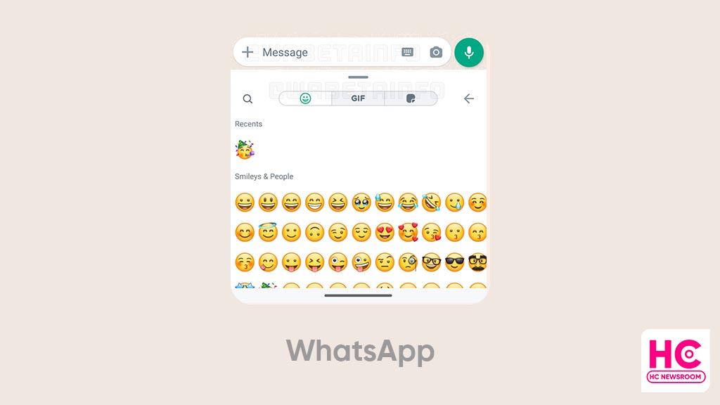
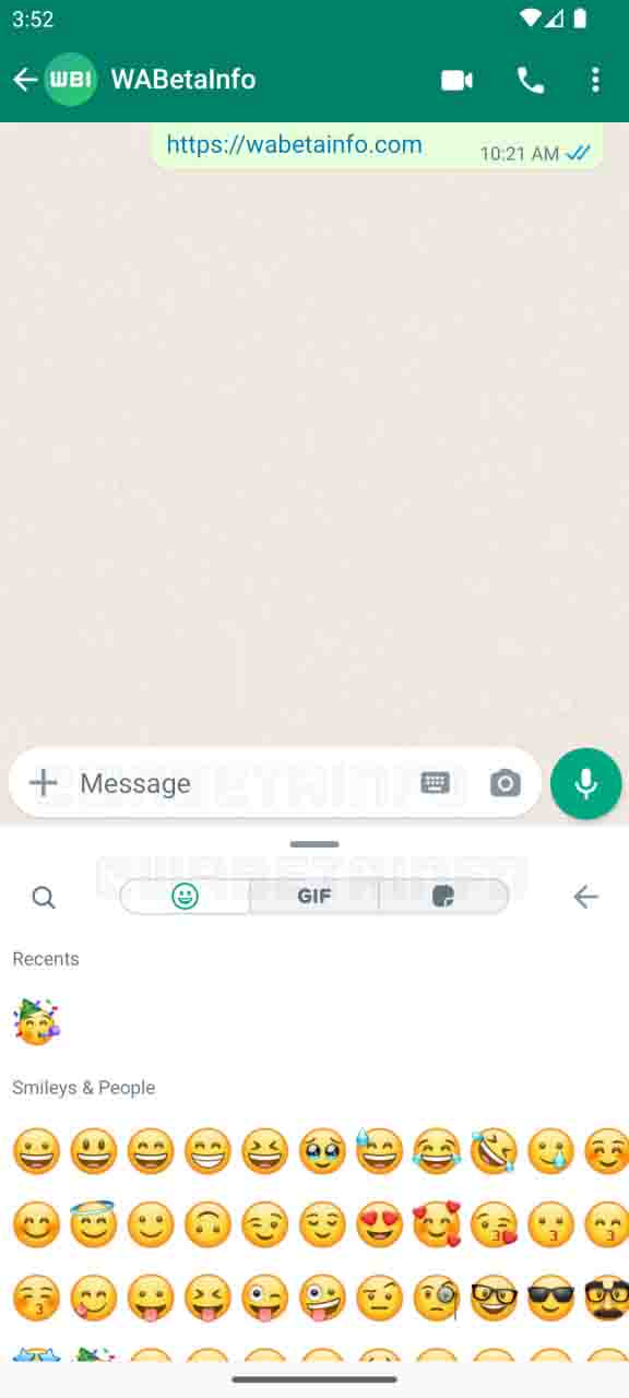
The bottom bar consists of the search option, and emojis, GIFs, and stickers are now shipped to the top side of the keyboard area. You should note that the three options are now alighted as a switch.
For example, if you select the emoji, the other two will be grayed out to reflect the current selection. Thereafter, the consequent menu will open on the screen.
Emoji:
WhatsApp keyboard redesign consists of a new emoji section, which appears on the same scene instead of the current layout with recent and all emojis side by side. You can see recent on top, followed by other categories such as “Smileys & people”
The categorizations will allow you to sort out and get the required emojis in separate groups.
Message bar:
There’s also a change in the text bar and it appears on the left side “+” icon, which could be for attachments. It’s new and previously, it was placed on the right side of the keyboard icon.

Compatibility:
The latest version also recalls the compatibility support end for devices running Android version 5.0 or lower. With the new version of WhatsApp, it can secure the user experience with the latest Android security patches.
Furthermore, there’s a bug on the WhatsApp start screen, which may occur the app logo larger than usual. This will be addressed with the upcoming beta rollouts.
You should know that the latest changes are part of the beta build and may change until the final rollout. Also, the company will release the new features for all users once these enters to stable mode.
(source)


