Android
Despite being an Android babyface, Samsung failed to understand dynamic theme in 2022
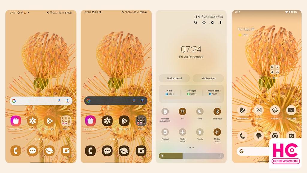
2022 is the year of Android 13 and Android phone makers spotted sending this software update with improved dynamic theme options, but as a babyface, it seems like Samsung still has not learned the core concepts of the dynamic theme.
Introduced with Android 12, the Material You powered dyanamic theme brings brand new settings to tweak the user interface. Instead of being just a feature, the dynamic theme became a part of Android’s soul. With Android 13, Google further polished the dynamic theme so it could be adapted to all Android devices.
Dynamic Theme (Simple version): Once you apply a new wallpaper, the phone generates a range of colors based on that wallpaper. The set of colors is called a color palette and it is then applied throughout the user interface.
Following the decline of Huawei, Samsung is enjoying unlimited Android prowess. It’s projected as a major Android promoter and a babyface. And why not? After all, the South Korean phone maker keeps on posting new mobile shipment records.
However, the handling of the dynamic theme in One UI 5 (which is based on Android 13) shows that Samsung wasn’t serious about being an Android babyface in 2022.
You may want to know, how I reached this conclusion and why Samsung is a failure when it comes to precise work. Let’s find out together.
Appearance:
The user interface is all about appearance, and so does the dynamic theme. Using the dynamic theme on Samsung One UI 5 is different from stock Android 13.
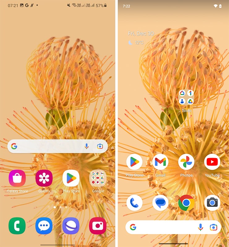
Note: I’ve used the same pixel wallpaper on both Samsung and Pixel devices. So, we can keep the comparison on the same level.
Home Screen:
Below is the home screen, which looks as usual on both One UI 5 and stock Android 13.
Quick Settings:
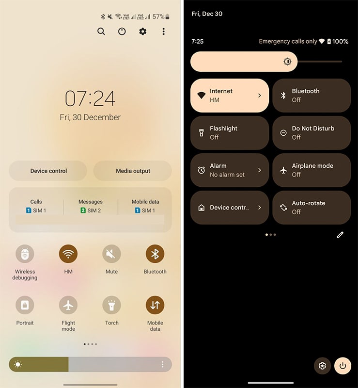
Both of the quick settings are using Material You in elements, such as quick access icons and sliders. However, the background on stock Android 13 is solid and remains black. On the other hand, Samsung uses a translucent background in the quick settings, which has not changed even with the Android 13. It is Samsung’s way of implementing features. While in some scenarios, this way obstructs the viewing experience.
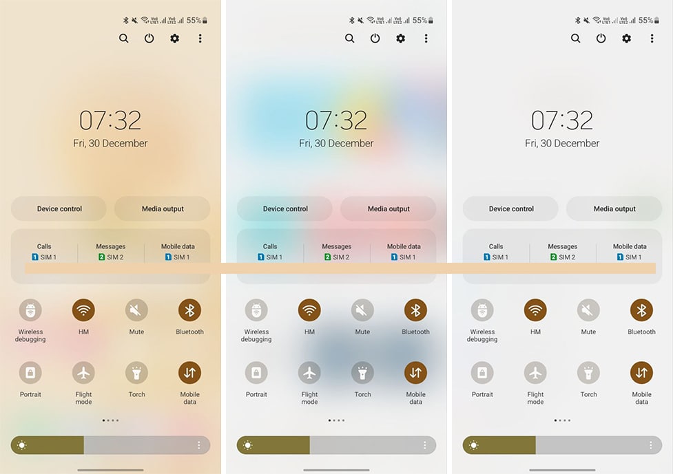
For example, the translucent background is now reflecting the colors of the app opened in the background. It also compromises the look and feel of the quick settings icons and the whole quick settings UI. But it becomes subtle when used on top of the Settings menu.
Below you can check the example of the quick settings opened over the following screens.
(Left – on top of home screen wallpaper, on top of Play Store, on top of Settings menu).
Settings:
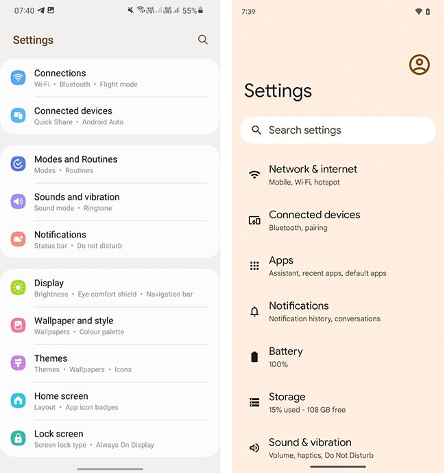
The setting is an important part of UI, which we access at least once a day. The layout, font, and elements are different in these two softwares. But Samsung used a slight proportion of the color palette in the Settings’ background and remain neutral for applying to the rest of the user interface.
Themed Icons:
I love themed icons because it brings a new look to the app icons. However, Samsung’s way of doing things is a little more disappointing than what it actually looks.
Below you can check Samsung One UI icons painted with color pallets alongside stock android icons. The use and management of contrast in the background and tint on the shape (size too) are super lazy on One UI app icons.
On the flip side, stock Android gets these things done in the best way possible.
![]()
There’s further inspection on this available, apply Dark Mode and see the change.
![]()
Verdict:
We don’t need to explain the results. But It is certainly not nice to implement the dynamic theme for the Android babyface Samsung in 2022.
What could’ve happened?
If possible, Samsung should’ve to blend more into the material rather than bleed into the material. Improve icons, and check visibility levels of the UI elements and the current issues may resolve to an extent.


