Comparison
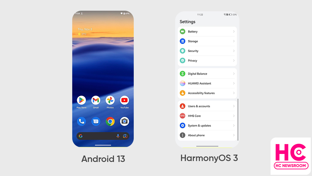
HarmonyOS 3 navigation bar is wider and better than Android 13

HarmonyOS 3 is a prime operating system and over the past two years, the Chinese tech maker has proved that it’s thinking par Android 13 to bring a new user experience, a example of this theory is the new navigation bar.
Yes, HarmonyOS 3 brings a new navigation bar that’s wider and better than Android 13. That’s how we’re bringing you this comparison between both of these mobile operating systems and checking what HarmonyOS 3 has to in the navigation bar offers over Android 13.
Android 13:
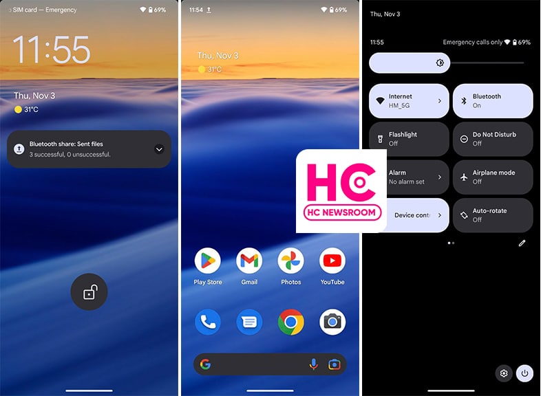
Although, Android 12 already had a navigation bar indicator but Android 13 enhances the appearance and makes it wide.
Talking about the interactions, the navigation bar on Android 13 sits on the very bottom of the screen but it doesn’t respond to gestures and remains static.
It is there all of the time, whether you are on the home screen, lock screen, quick settings, or in the application. However, it does go out while playing a full-screen app or video. Aside from these aesthetics, Android 13 gestures are good and react fast.

HarmonyOS 3:
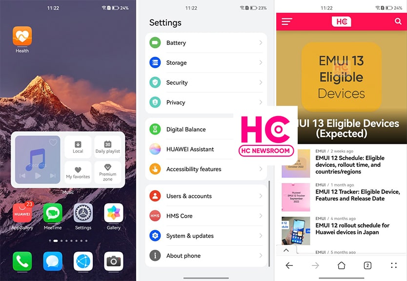
This new HarmonyOS version comes with a wide navigation bar indicator that is wider than Android 13. The indicator wasn’t available in the past version and making its debut.
The interesting part of the story lies in the fact that it is interactive from the core. For example, if you swipe up, the indicator will animate with the motion of your swipe gesture.

More on this, the navigation bar indicator on HarmonyOS 3 hides on the lock screen, control panel, and home screen to showcase the full screen. Meanwhile, it only appears when you open or navigates to Settings or apps. However, there should have been a navigation gesture sensitivity controller, which is available already on Android devices.
Yeah, Huawei HarmonyOS is improving the user experience and trying to match the standard that mobile user loves to surf. On the side, Android is only trying to evolve with low-key innovations.


