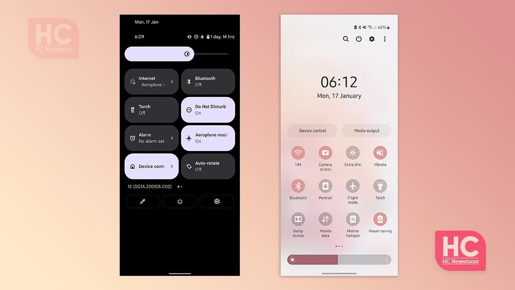
Comparison
Stock Android 12 vs One UI 4.0: Quick Settings comparison

Last year, Google released its latest Android version – Android 12 that comes with various features and customizations. Different phone makers are adopting Android 12 including Samsung, the world’s largest phone maker. Though Google releases Android operating system upgrades but Samsung keeps them in a slightly steady manner with software updates that roll out on time.
Therefore, a healthy comparison between One UI 4.0 and Android 12 is a must-to-do task and we’re ready to perform it. For your information, Samsung One UI 4.0 has a lot of new customizations that make it one of the best customized Android mobile software. The latest version has new improvements for user interface, features, and UI customization such as a color palette that makes the user experience vivid.
On the other hand, Stock Android is an open space that has nothing to worry about the customizations, it’s just a simple plane Android that runs on Pixel devices and similar ones. But Stock Android 12 is something that you should check if you own a Pixel smartphone.
After these instructions, let’s begin our comparison saga between One UI 4.0 vs Stock Android 12 for the Quick Settings menu.

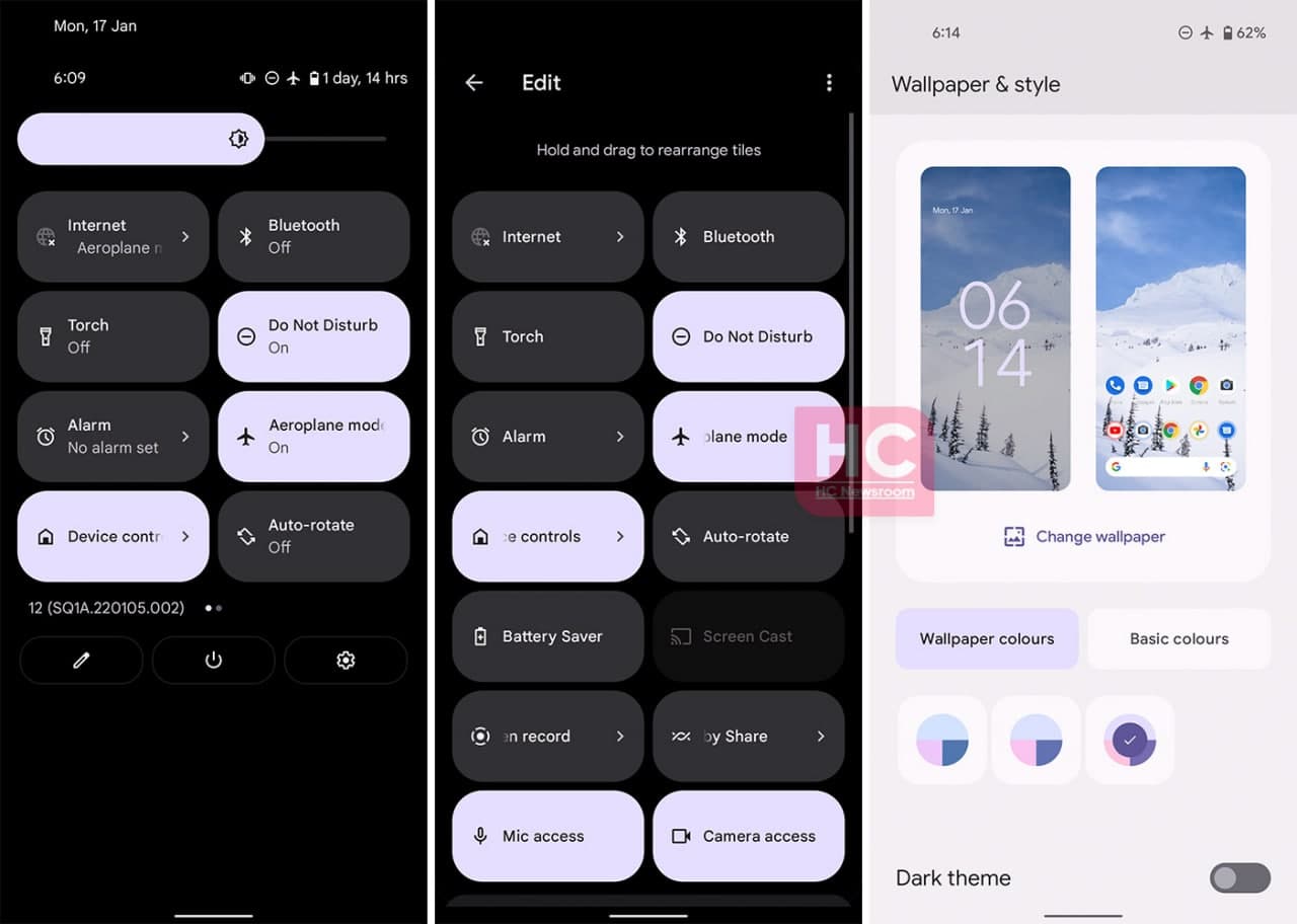
First comes Android 12:
You need to swipe down to open the Android 12 quick Settings menu and access the quick access switches. As shown below, Samsung has brought in a new tiles system that will enhance the user experience. The tiles are big and easy to touch, so, there’s no chance of missing a tap. You can also customize the order and the tiles from the quick settings menu.
Furthermore, Android 12 will take care of your concerns over the customizations with its new Material You theme options that automatically generate a color pallet for primary and accent system UI colors based on your phone’s current home screen wallpaper. The Material You is something new and increases the looks and appearances efficiently without requiring the installation of any third-party plugin.

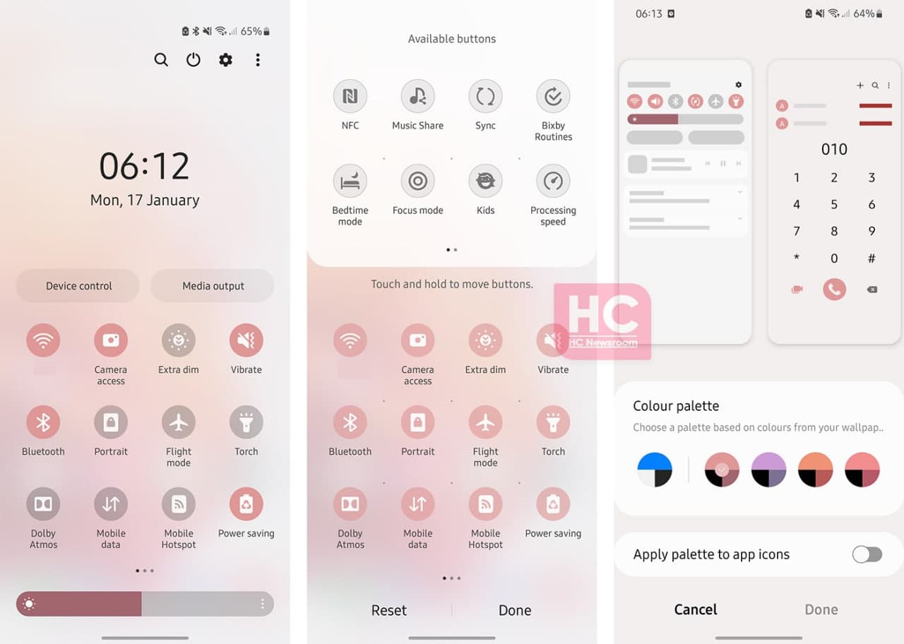
One UI 4.0
Samsung One UI 4.0 continues to carry a Quick setting layout from One UI 3.1, except the company has made minor tweaks in the arrangement of top labels and quick access icons are brighter and easy to spot. On the other hand, the brightness and sound sliders look better than before. The overall looks and feel of the user interface have been improved as compared to the One UI 3.1 software that does make a difference in user experience.
Don’t forget that One UI 4.0 comes with a new color palette feature that allows you to make some changes are the Material You since it’s also an Android 12 adaptation.

Conclusion:
From a consumer‘s perspective, both of these quick settings user interface comes with lots of new options. However, the One UI 4.0 seems more friendly and easy to navigate as compared to the Android 12. Also, there are a lot of options that could show up on the One UI 4.0 screen view that may not appear on stock Android 12 quick settings.


